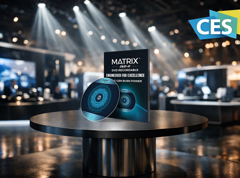
CES Las Vegas Brand Showcase

Category: Trade Show Branding & Print Design
Client: Twin Material, Inc.
Industry: Recycling & Sustainable Materials
Location: California, USA / Taiwan
Deliverables:

OVERVIEW

Twin Material, Inc., the largest recycling company in Asia, specializes in transforming post-industrial plastic waste into reusable raw materials. With over 30 years of experience in Taiwan and a growing presence in the U.S. market, their goal is to expand visibility, credibility, and connection with potential partners at CES Las Vegas, the world’s most influential tech event.

ROLES

Team Designer (Me)
  • Art Direction

  • Graphic Design

  • Visual Strategy & Branding

  • Print Layout Design

  • Color & Typography System Development

Marketing Manager
  • Defined target audience and campaign objectives.

  • Provided input on messaging, brand tone, and sales pitch.
  • Approved concepts aligned with marketing strategy.

THE STRATEGY

The CES environment is saturated with tech-forward brands, making differentiation key.
Our strategy was to balance industrial precision with environmental integrity, developing a brand presence that communicated:

  • Sustainability in Action – Recycling as a continuous, circular process.

  • Global Expertise – 30 years of innovation and reliability.

  • Modern Confidence – Clean design that aligns with technological sophistication.

The Challenge

Twin Material’s existing materials focused heavily on technical data and lacked emotional storytelling.
The challenge was to translate complex recycling processes into clear, approachable visuals while maintaining professionalism and consistency across different formats—from large backdrops to small business cards.

the Approach

To guide the visual system, I developed a mood board inspired by recycling processes, material textures, and the flow of transformation—from waste to new beginnings.

mood board (Typography, Colors and Imagery)
  • Typography :

    • Primary Font: Montserrat – Modern and Geometric.
    • Secondary Font: OldCentury Regular – Tradition and Reliability for logo.
  • Color Palette:
Primary Secondary Accent Accent
#003333 #42916C #8DC787 # E2E0E0
Dark Green Green Soft Green Light gray
Stability and professionalism Sustainability and growth Eco-friendliness Technology and recycling materials
  • Imagery : Visuals incorporated subtle textures of recycled pellets and plastic fragments, along with clean environmental photography, bridging the industrial and eco-friendly worlds.
Design Decisions

Once the concepts were approved by the Marketing Manager, I developed design concepts inspired by recycling processes, material textures, and the flow of transformation.

The Execution

Motion
  • Video Intro: I created this video intro with AI-generated clips from Sora as a visual experiment. I began with dramatic, moody visuals to reflect the overwhelming reality of plastic and optical media waste, using dark lighting and slow movement to let the viewer feel the weight of the problem. As the sequence progresses, the visuals become more structured and refined, symbolizing the transition from chaos to purpose. This shift mirrors Twin Material’s mission, taking what is disorganized and overlooked, and transforming it into something valuable and sustainable. Recycling is not the end of a product’s life, it’s the beginning of its reinvention.
Core Brand
  • Logos: The circular design visualizes the recycling process, and the core messages are centered for strong visibility. I wanted the contrast to speak — industry meets innovation, technology meets nature. The logo, blending a gear and a leaf, became the heart of the story.
  • Business Cards: I designed this business card to feel like small in size, yet powerful in meaning. The bold dark green background stands for strength and precision, while the vivid green elements breathe life and sustainability into the design.

  • Brochures: To make the brochure visually engaging, I added the circular recycling symbol subtly at the center. In addition, I used icon table for easy scanning and each plastic type should have its own icon.
Display
  • Trade Show Backdrop: The circular design visualizes the recycling process, and the core messages are centered for strong visibility. I wanted the contrast to speak — industry meets innovation, technology meets nature. The logo, blending a gear and a leaf, became the heart of the story.

Key Takeaways

  • Transformation: Design as a bridge between industry and sustainability.

  • Clarity: Simplified visuals that communicate complex recycling systems.

  • Trust: Professional tone that aligns with decades of expertise.

  • Engagement: Consistent design language across all materials.

  • Impact: Enhanced visibility and credibility in global markets.

Next Projects