Mom’s Best Food Restaurant

Category: Branding & Print Design
Client: Mom’s Best Food Restaurant
Industry: Food & Beverage — Vietnamese Restaurant & Hospitality
Location: Texas, USA
Deliverables:

OVERVIEW

Mom’s Best Food is a Vietnamese fine-dining restaurant based in Texas, known for its cozy ambience, family-friendly environment, and beautifully crafted dishes inspired by traditional home-cooking techniques. The owners wanted a brand identity system that felt warm, modern, and polished—something that captured the essence of “home-cooked comfort,” while still elevating the experience to fine dining. I was asked to create a unified brand system that extended across their entire visual presence: menu design, business cards, flyers, brochures, vouchers, social media graphics, and online ordering assets.

This project became a storytelling experience—a chance to translate the heart of their homemade cuisine into a cohesive visual language.

ROLES

Designer (Me)
  • Developed the overall visual identity and personality for the restaurant.

  • Defined the color palette, typography system, and visual style to reflect cozy, modern, family-friendly Vietnamese dining.

  • Designed all print collateral including menus, business cards, flyers, brochures, and vouchers.

  • Created digital assets for social platforms and online ordering.

Owner
  • Worked closely with the me to develop promotional priorities.

  • Provided direction for featured dishes, seasonal promotions, and social media highlights.

  • Helped shape messaging around authenticity, family recipes, and signature techniques.

THE STRATEGY

I approached the project with a clear balance in mind: combining emotional warmth with modern clarity. The brand needed to feel familiar and comforting, yet polished enough to support a fine-dining experience. I focused on consistency across print, digital, and motion, ensuring the brand felt unified whether customers were dining in, browsing online, or discovering the restaurant on social media.

The Challenge

The owner wanted a design that balances fine dining sophistication with homestyle warmth. The owners wanted a design that balances fine dining sophistication with homestyle warmth. Another challenge was designing for a large and detailed menu while maintaining readability and elegance. The brand also needed to work across many formats, from menus and brochures to promotional vouchers and short-form video, without losing visual consistency. Every piece had to feel connected while serving a different purpose.

the Approach

mood board (Typography, Colors and Imagery)
  • Typography: I paired friendly, modern typography with subtle character
  • Montserrat: Clean and modern.
  • Varela Round: Soft and approachable, reinforcing the family-friendly tone.
  • Fake Serif: Used sparingly for emphasis, adding warmth and personality.
  • Colors: I selected a warm, food-inspired color palette to reflect comfort, richness, and approachability:


Primary Secondary Accent Accent
#510909 #ff9933 #f8e7cf # ededed
Deep wine red Vibrant orange Soft cream Light neutral gray
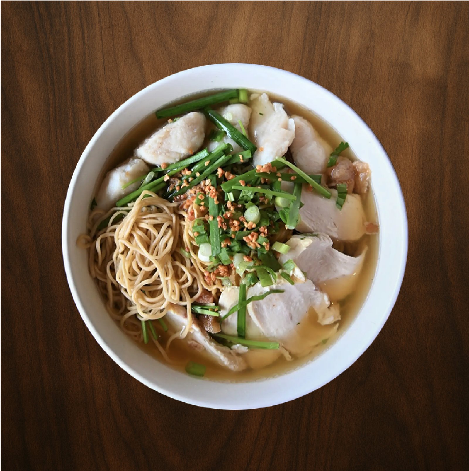
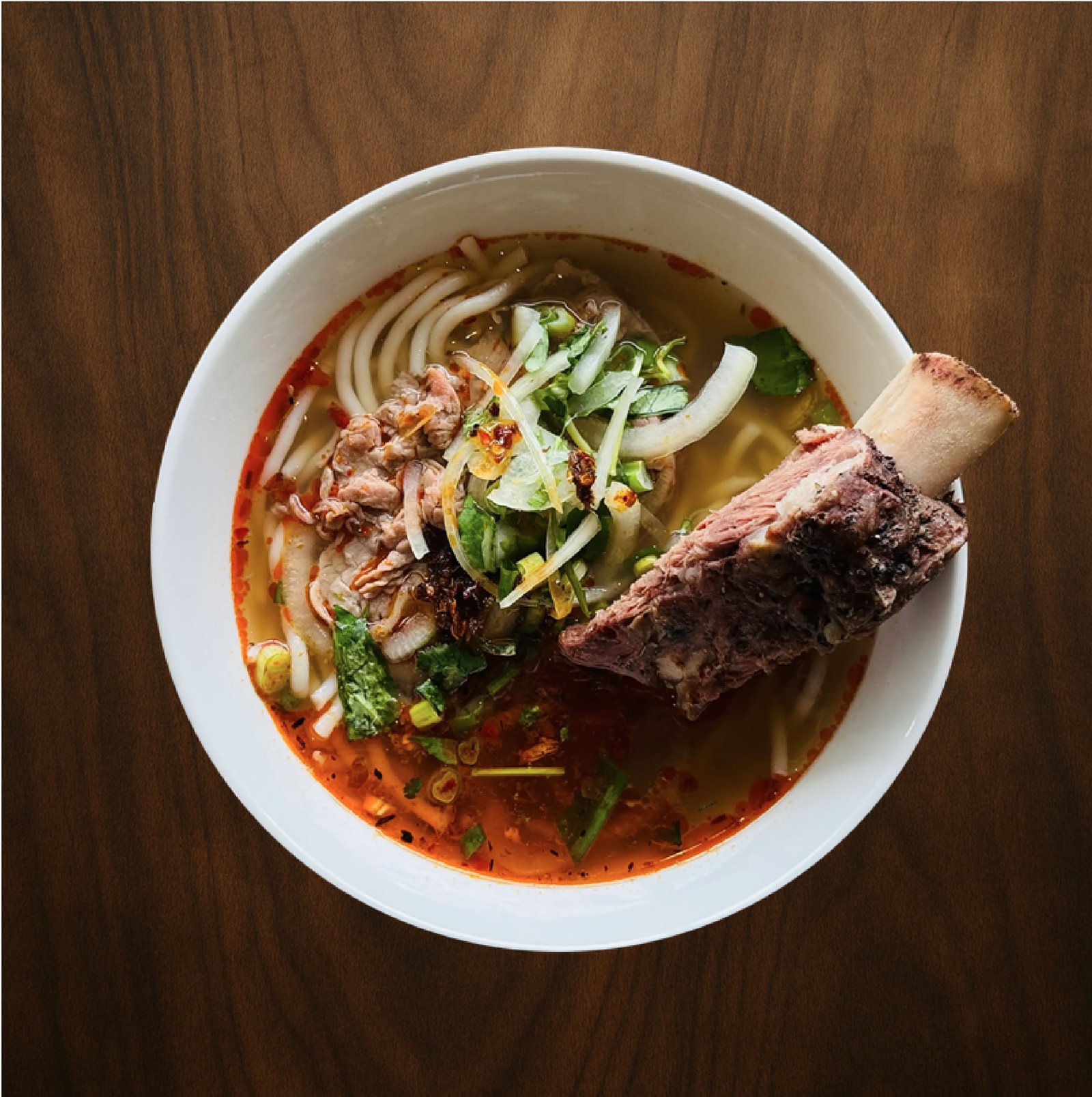
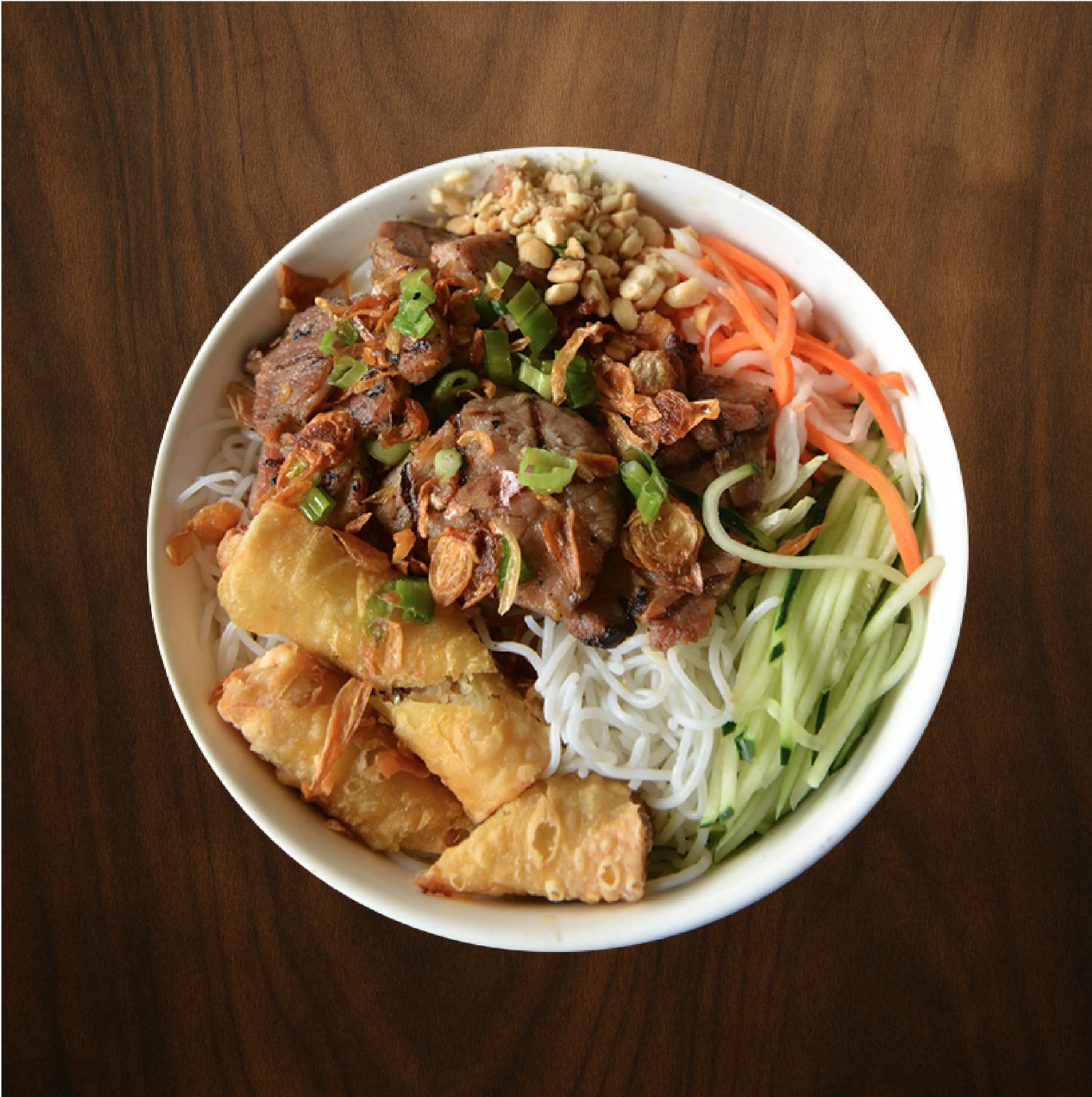
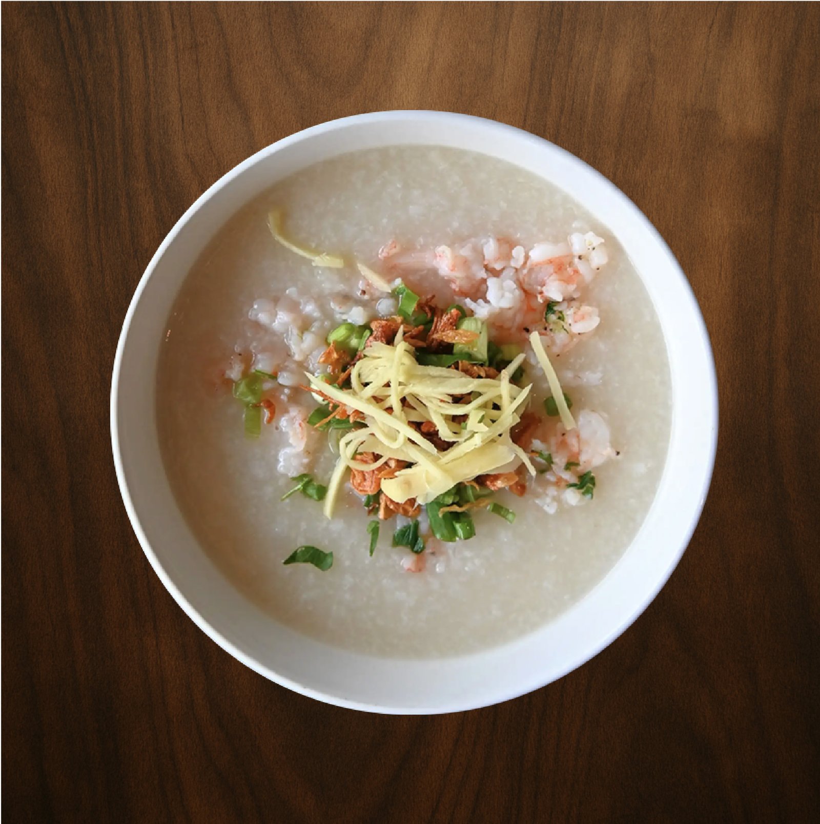
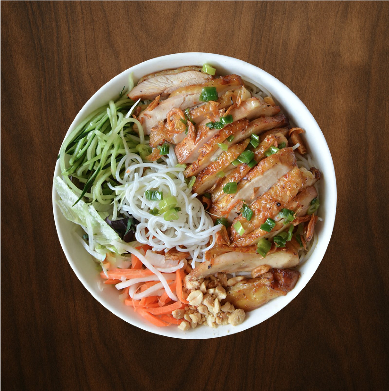
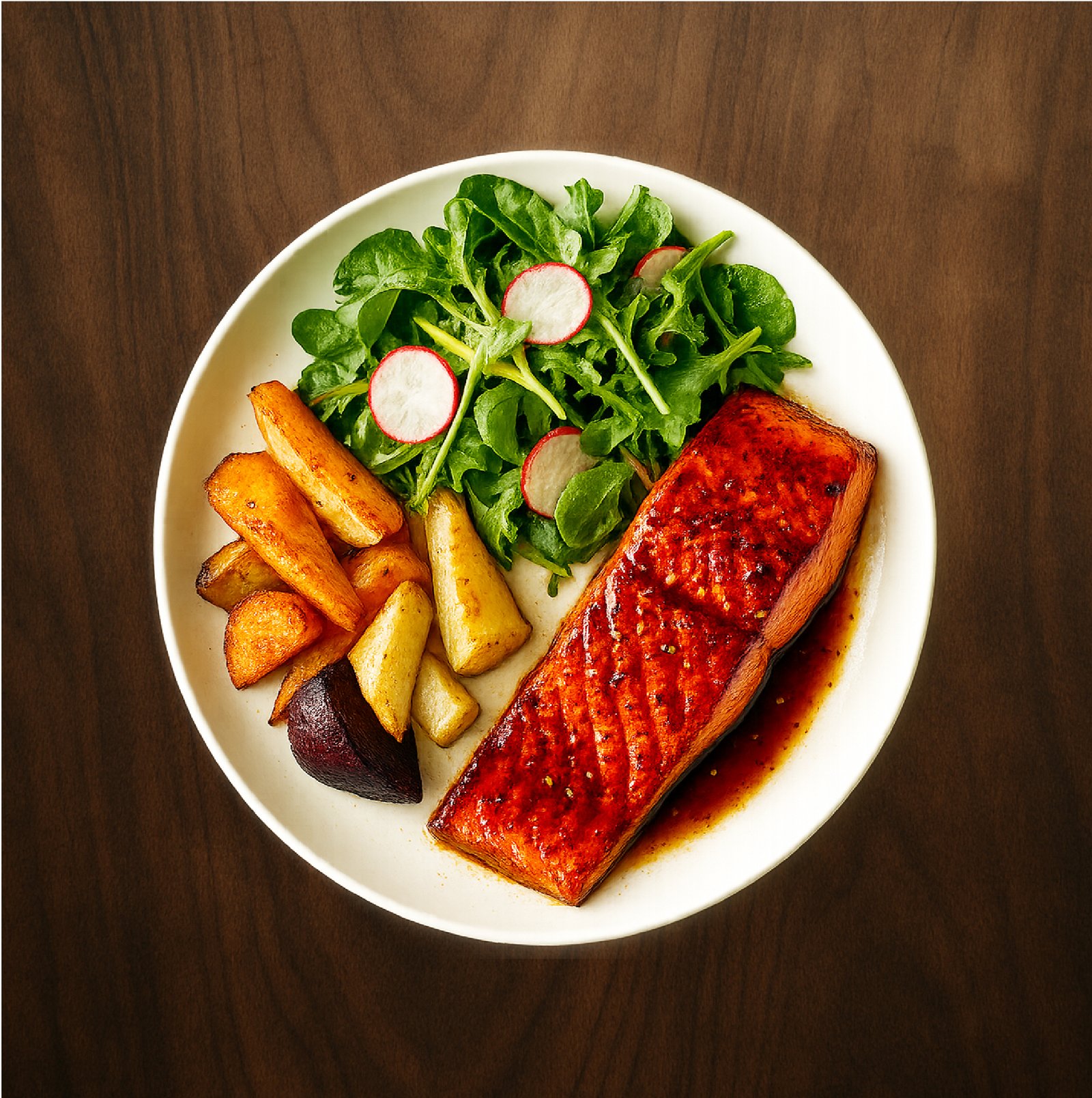
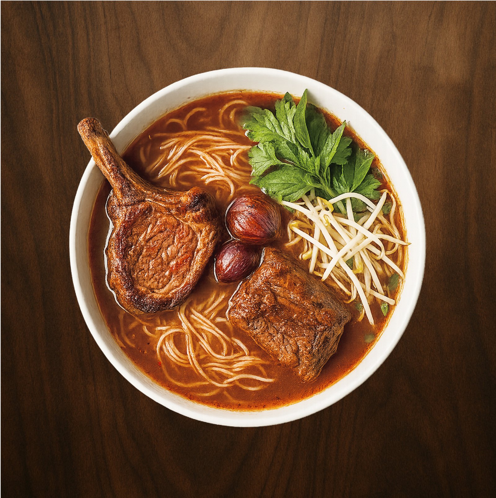
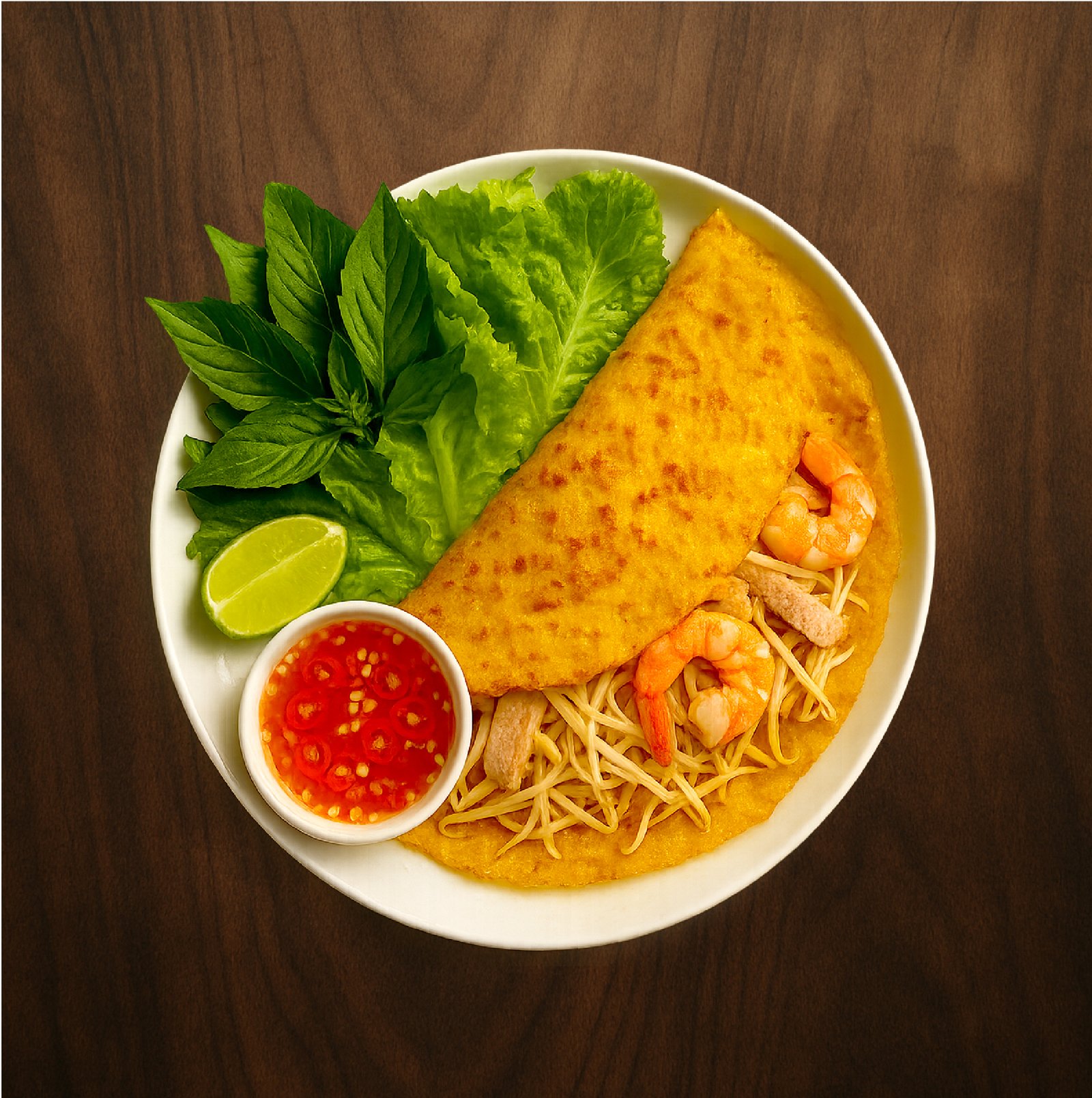
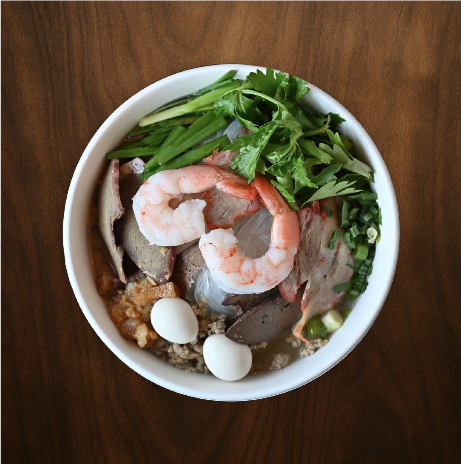
  • Imagery: I chose imagery that emphasizes warmth, authenticity, and the feeling of home, focusing on real food, fresh ingredients, and natural textures. Close up dishes, herbs, and family style table settings help communicate comfort and togetherness, while warm lighting and modern details keep the brand refined. Every image supports a consistent visual story that feels inviting, personal, and thoughtfully crafted.
Design Decisions

I collaborated closely with the owner to understand their vision, culinary inspiration, and the balance they wanted between home style comfort and fine dining. Through regular feedback and design reviews, I refined colors, typography, imagery, and layouts to ensure every decision felt authentic and purposeful. This collaborative process helped translate the owner’s story into a cohesive and professional visual identity.

The Execution

Motion
  • Video Intro: I designed this video intro to feel warm and cinematic. I used slow, intentional pacing and rich, warm tones to mirror the comfort of home style Vietnamese cooking. Each frame is meant to feel sensory, highlighting atmosphere, texture, and warmth. I focused on smooth transitions and gentle motion to create a calm, welcoming rhythm that reflects care, tradition, and quality. The logo reveal is subtle and confident, reinforcing brand recognition without overpowering the story.

Core Brand
  • Logos: I designed the Mom’s Best Food logo to capture the warmth and comfort of home style cooking while ensuring flexibility across different applications. I created light and dark background versions to maintain strong contrast, readability, and visual consistency across print, digital, and promotional use. The friendly illustrated character serves as the emotional core of the brand, creating a simple yet meaningful design that speaks to the heart of the restaurant’s work.

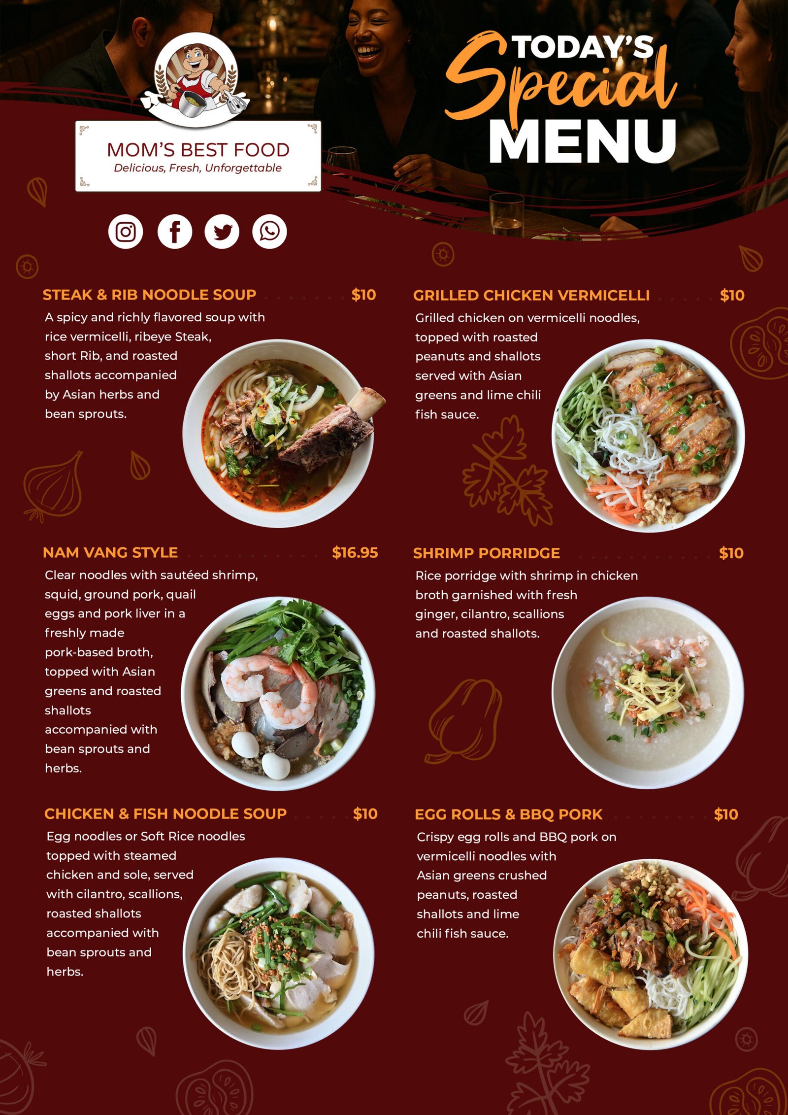
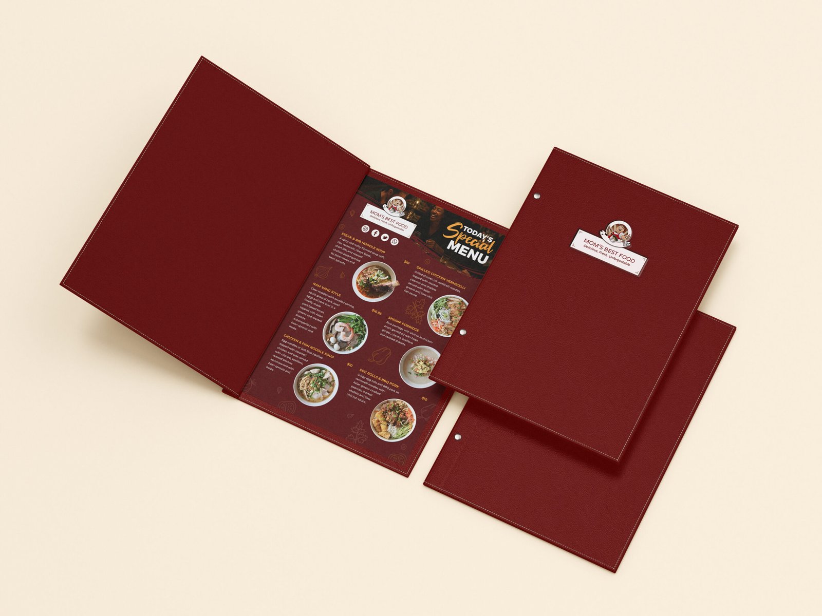
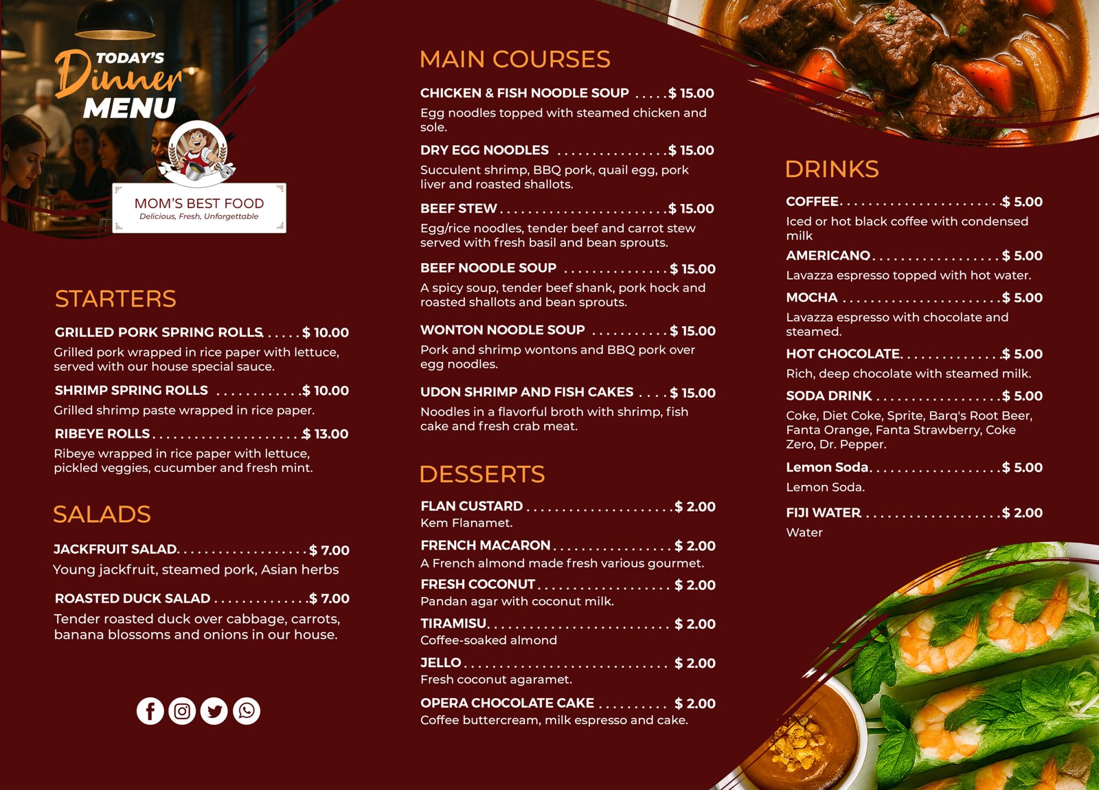
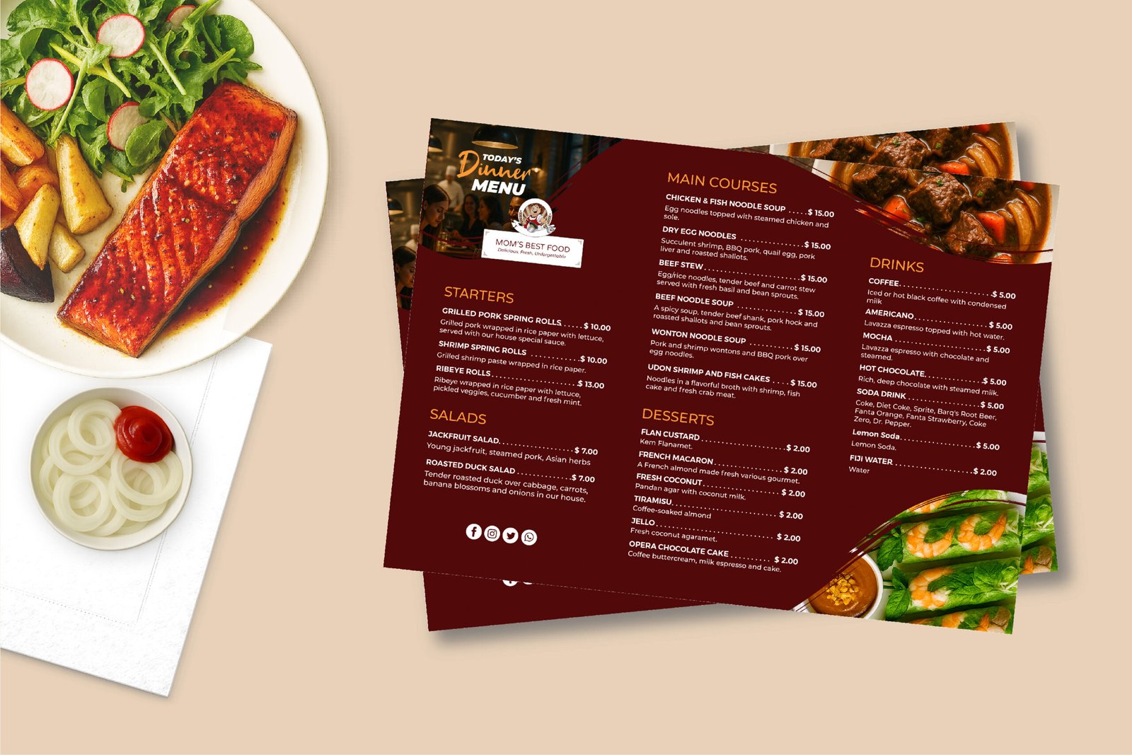
  • Special Menu: I designed this menu to feel warm, inviting, and easy to scan, using a deep red background to enhance appetite and make the food photography stand out. A clean two column layout, clear typography hierarchy, and consistent pricing placement help guide customers smoothly through the menu. Subtle brand elements and decorative accents tie the design back to the overall identity while keeping the focus on the dishes.
  • Full Menu: I designed this menu to feel immersive and refined, using a deep red background and lifestyle photography to place the viewer within the dining experience. Clear section grouping, consistent typography, and dotted leader lines make a large menu easy to scan and navigate. Subtle brand details and balanced spacing maintain a cozy yet modern fine dining tone throughout.
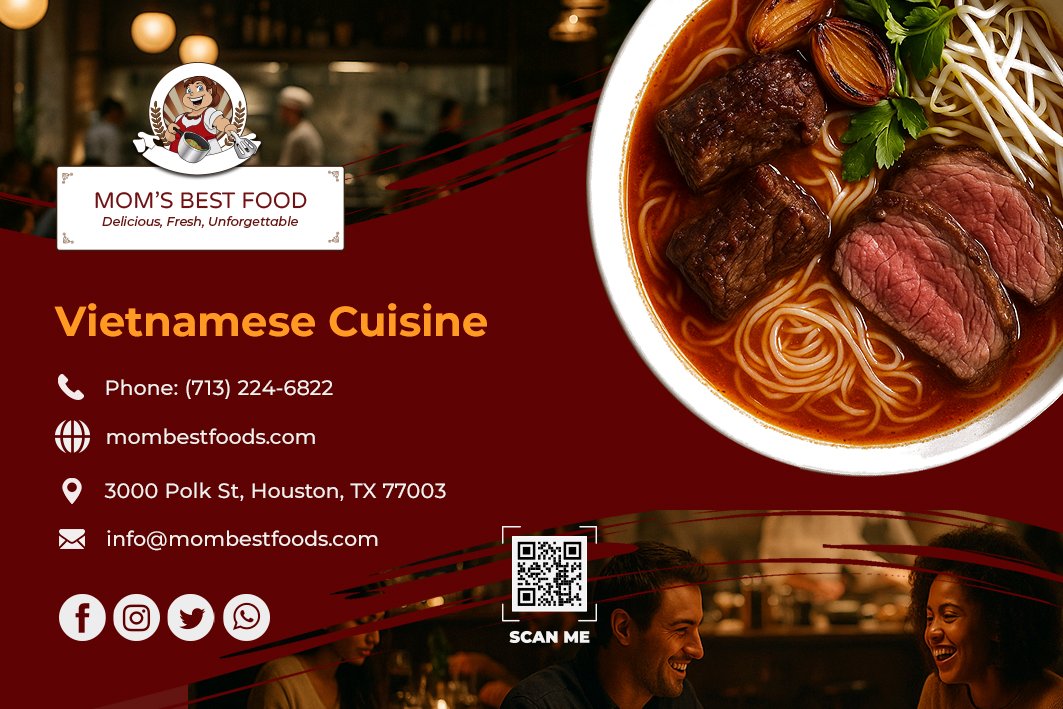
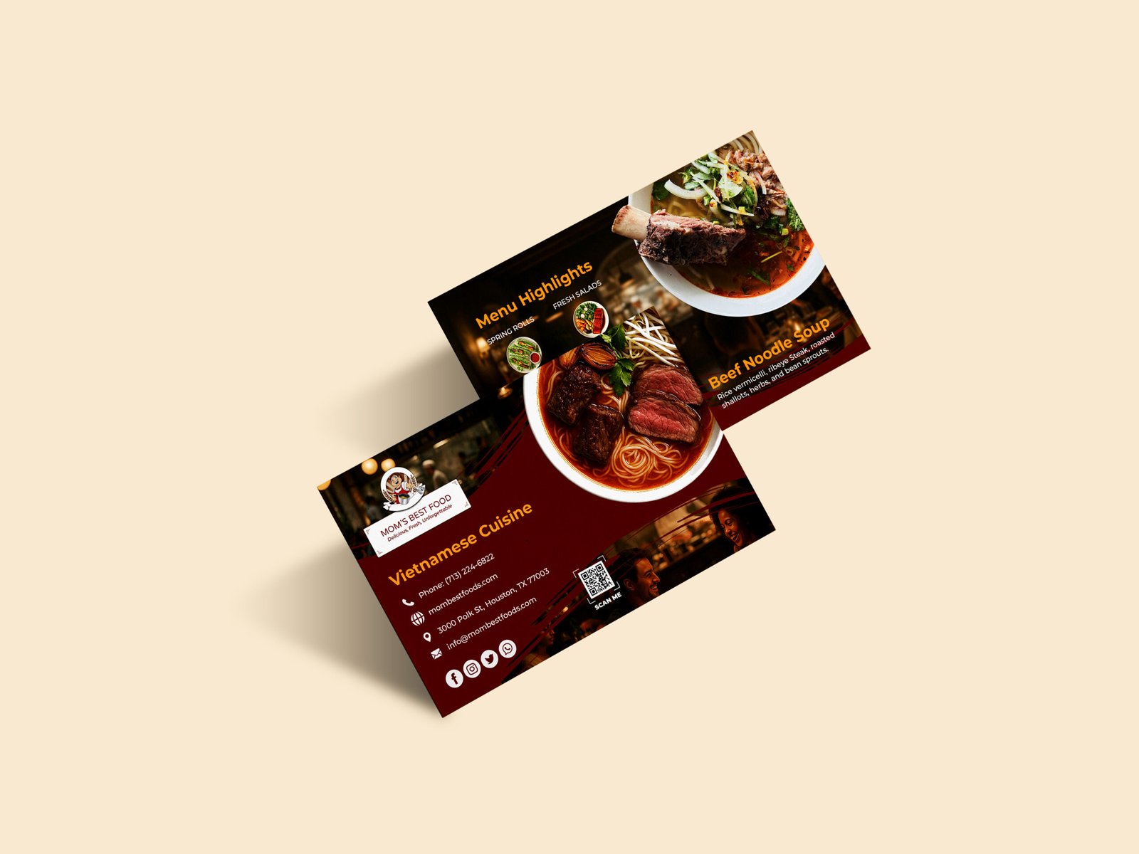
  • Business Cards: By using lifestyle photography of people enjoying a meal together, I wanted the design to feel alive, social, and welcoming, more than just a restaurant, it feels like a place to gather. The warm lighting, rich tones, and candid moments help communicate comfort, authenticity, and a fine dining experience that still feels relaxed and personal.
Marketing & Promotion
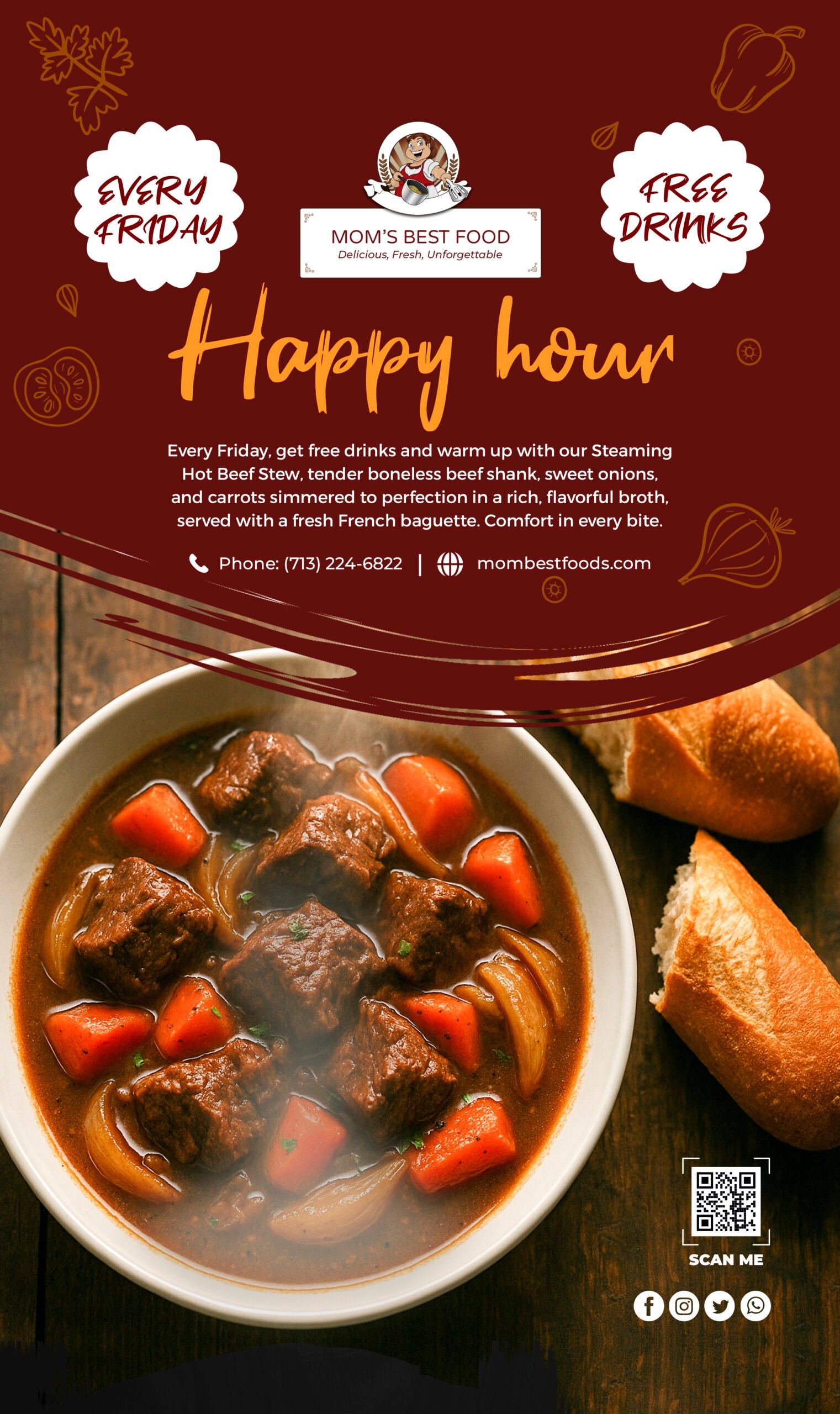
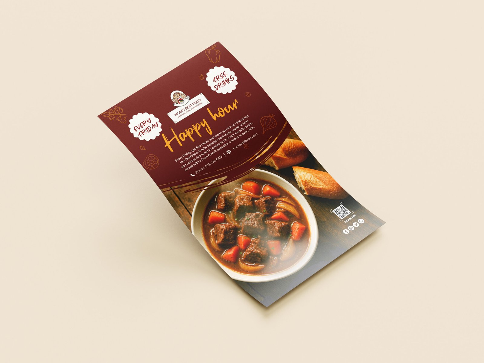
  • Flyer: I used rich, warm tones and lifestyle imagery of people sharing a meal to set an inviting, social mood, while the close up of the steaming beef stew anchors the design with appetite appeal and emotional comfort. The contrast between the lively dining scene and the hearty dish helps tell a story of Friday evenings spent relaxing, laughing, and enjoying something special.
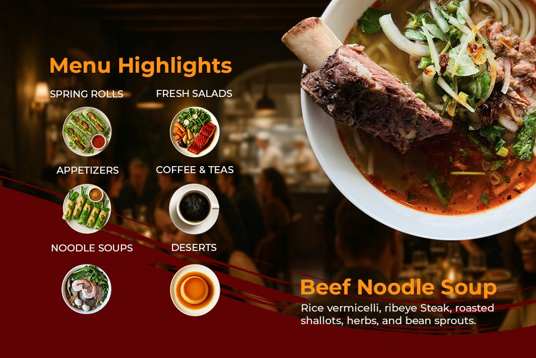
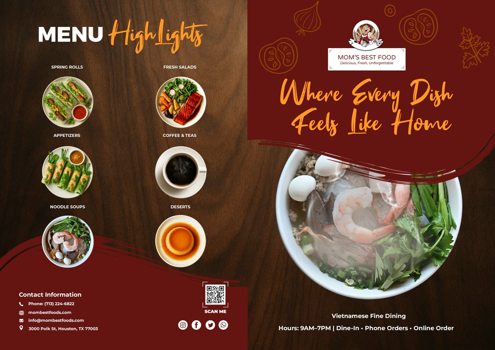
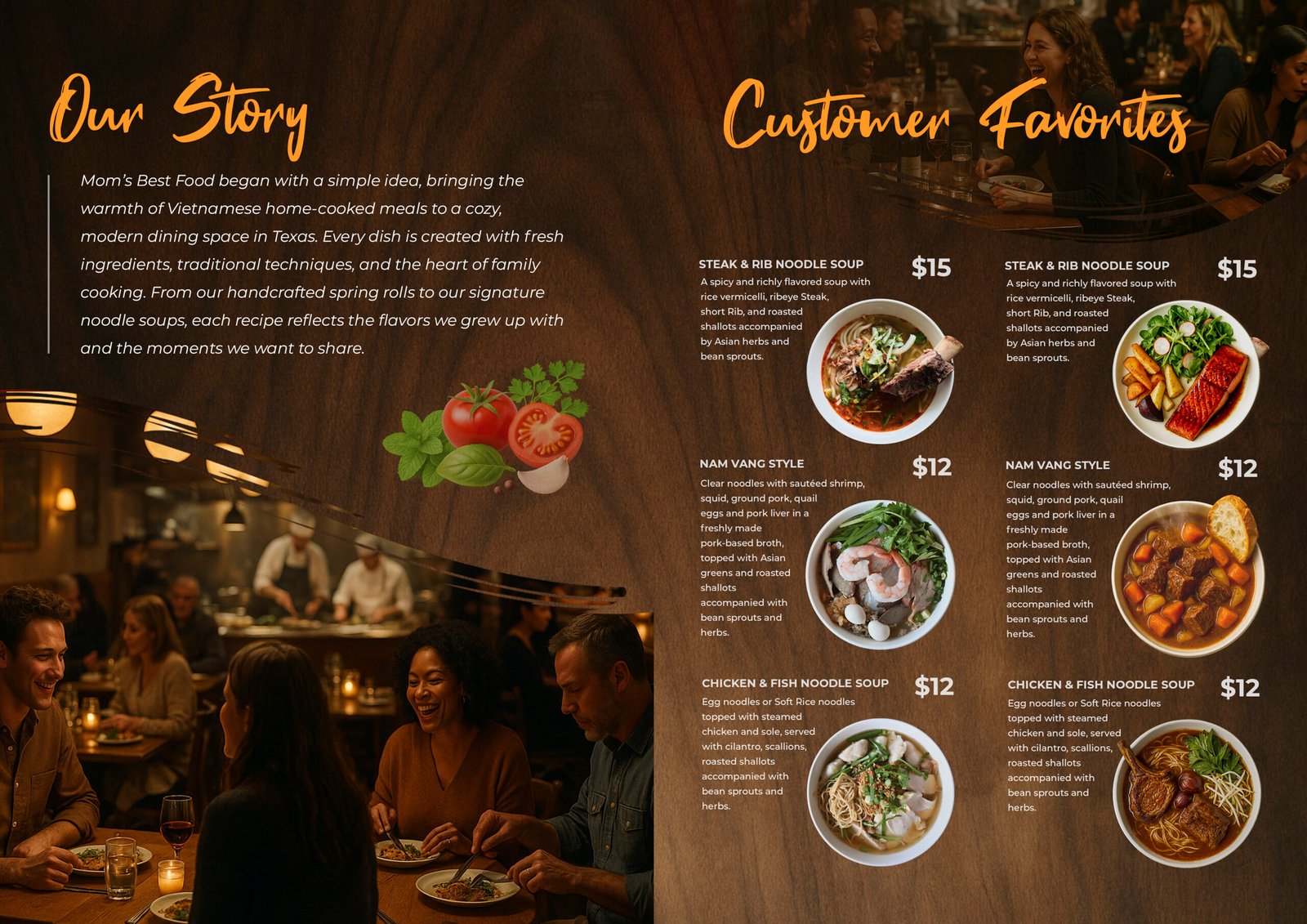
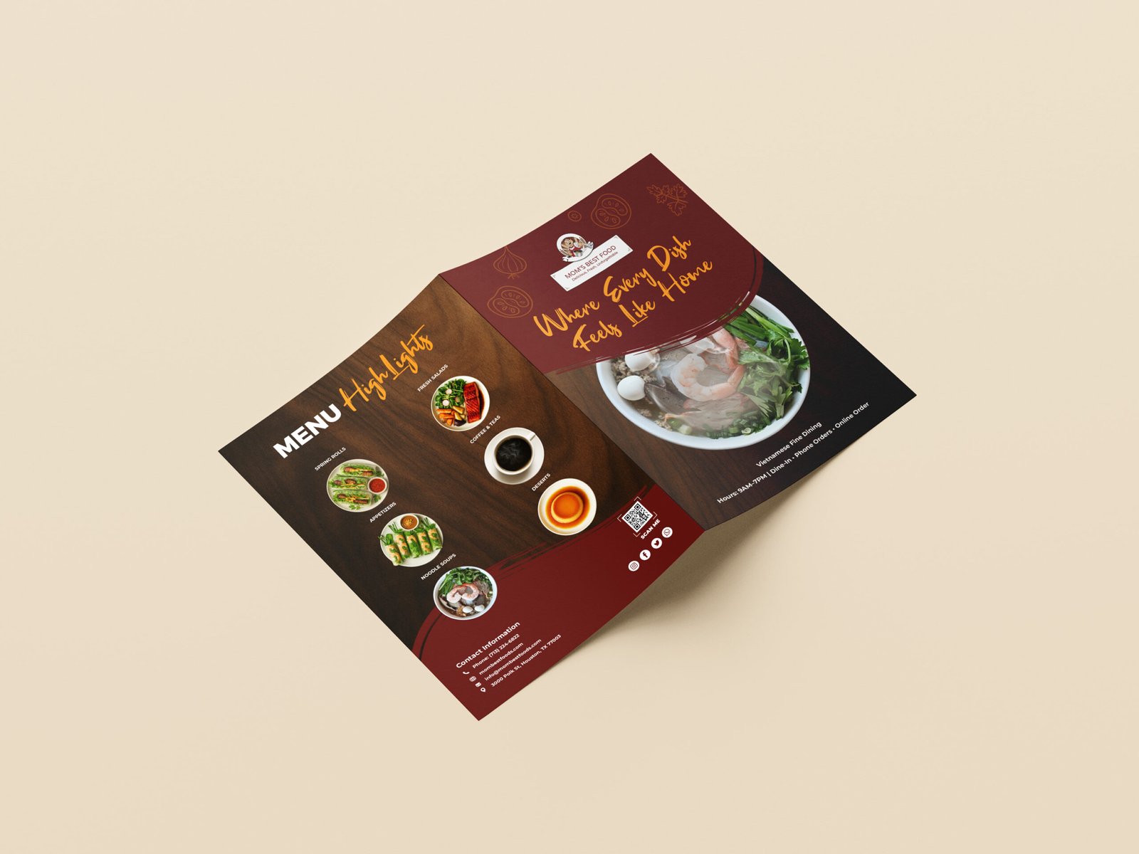
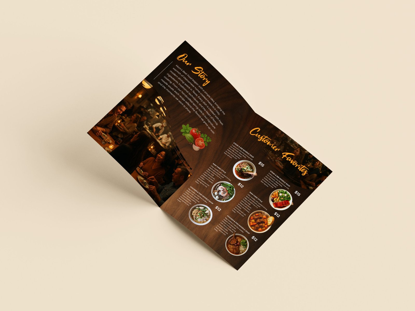
  • Brochures: I designed this brochure to feel warm, immersive, and welcoming, using rich colors, lifestyle imagery, and appetizing food photography to reflect the comfort of Vietnamese home style dining. The front and back covers set the emotional tone and provide clear contact information, while the inside panels balance storytelling with structured menu highlights. Every element works together to create a refined yet approachable brand experience that invites guests to feel at home.
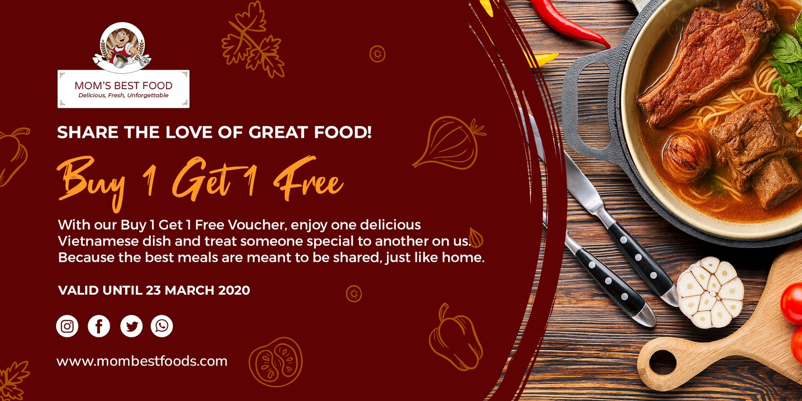
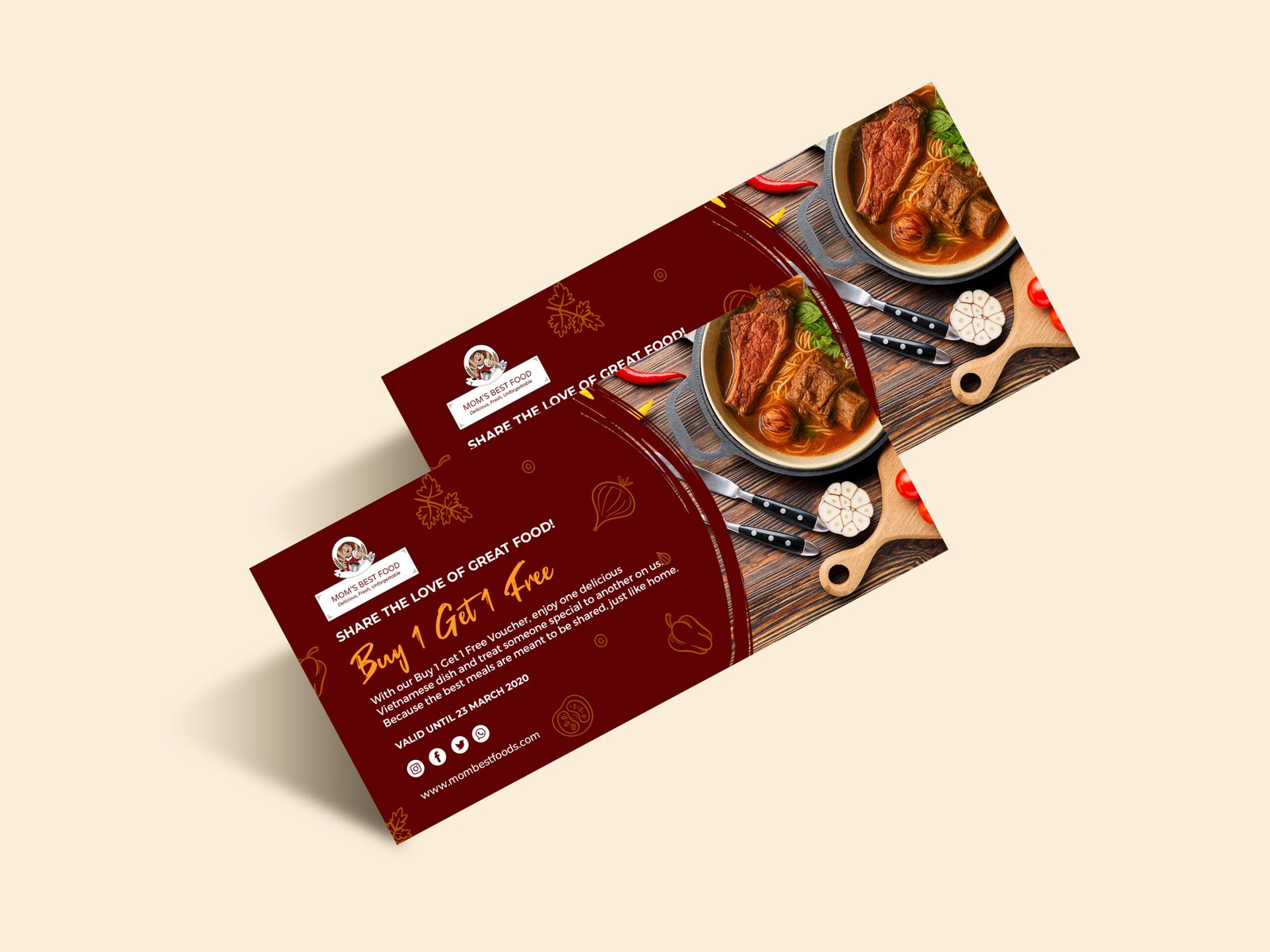
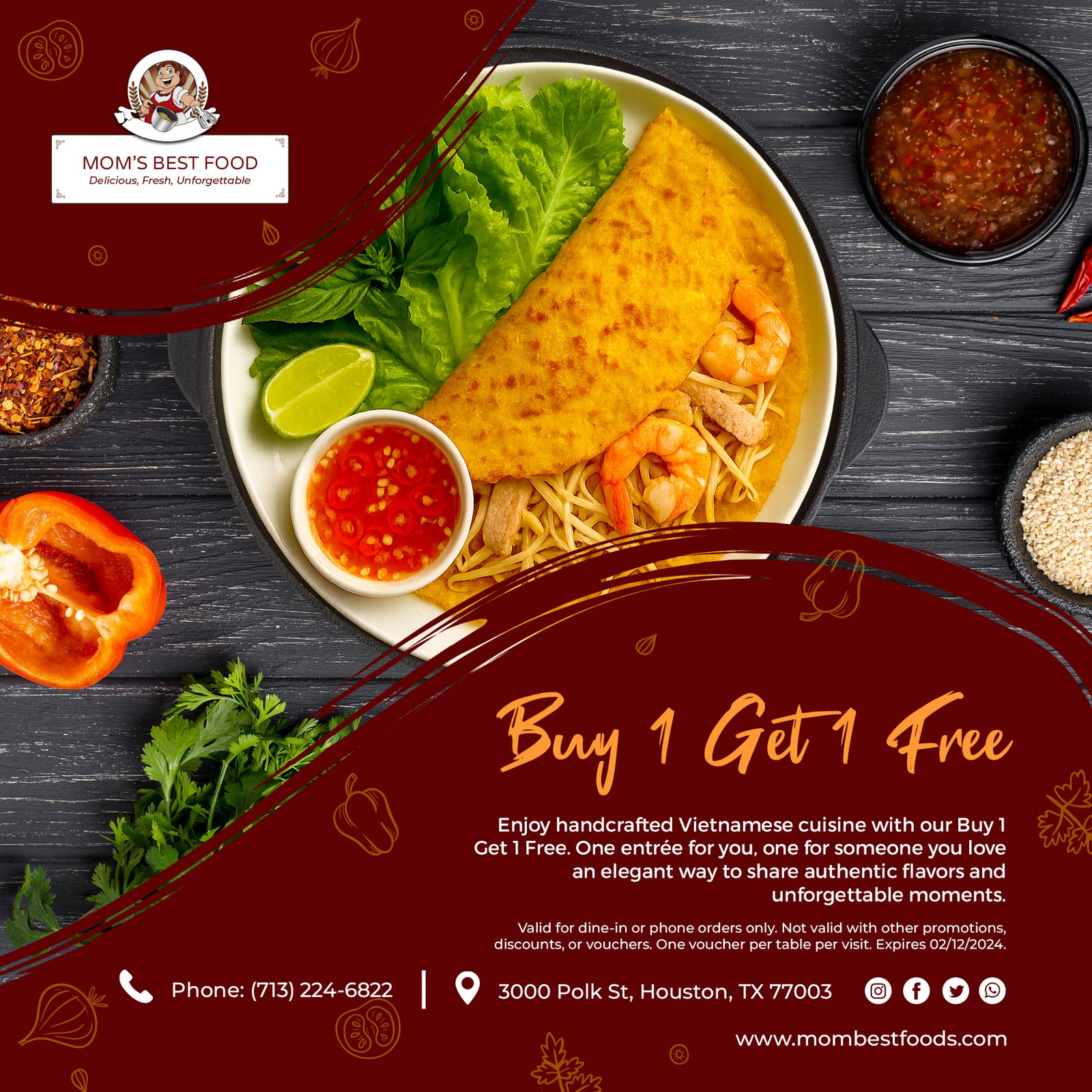
  • Voucher: I designed this voucher to feel warm, generous, and emotionally driven, more like a gift than a discount. The rich, deep red background sets a comforting, appetizing tone, while the close up food imagery reinforces quality, warmth, and home style cooking. I used a handwritten style headline for “Buy 1 Get 1 Free” to add a personal, celebratory feel, making the offer feel inviting rather than transactional.
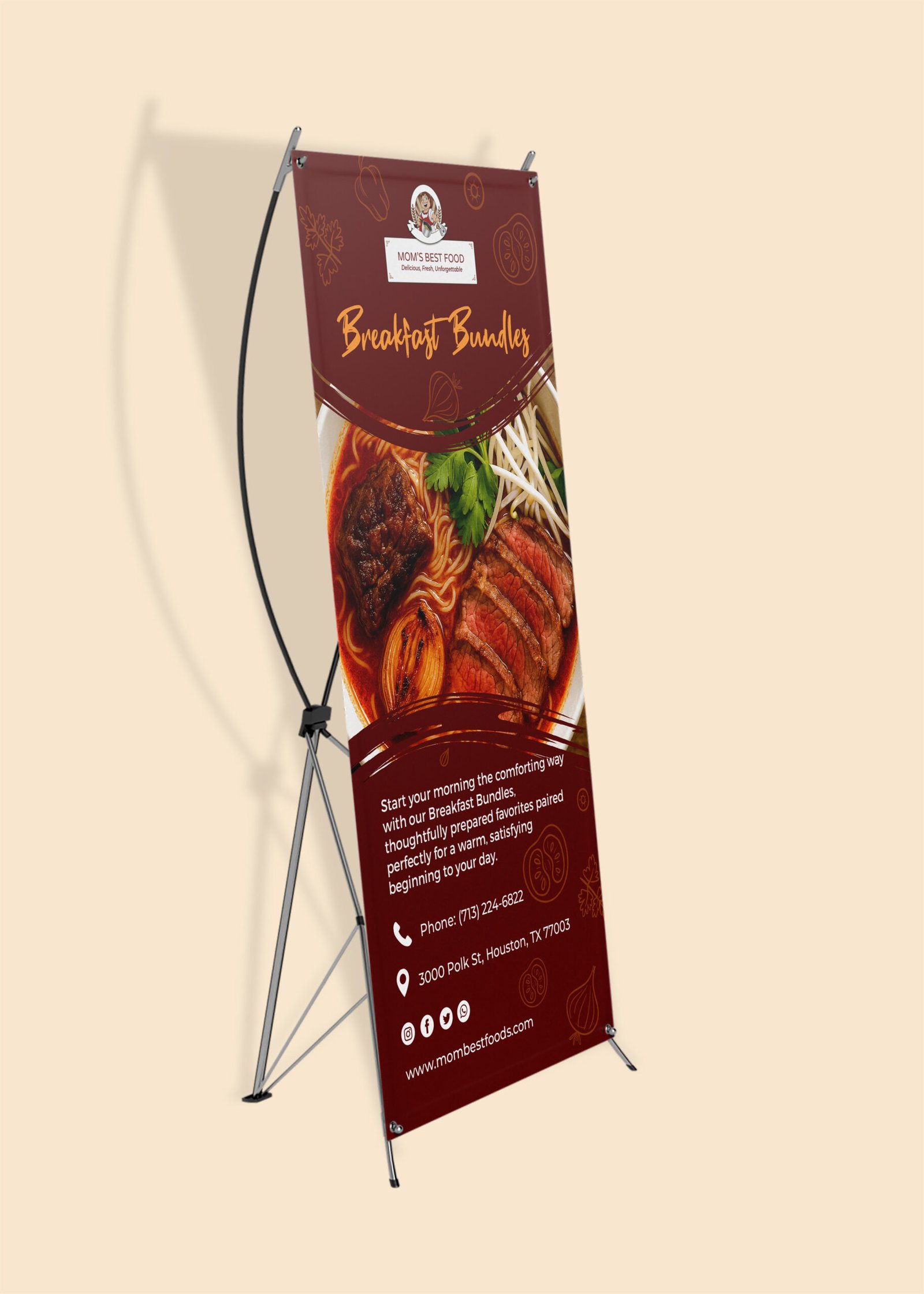
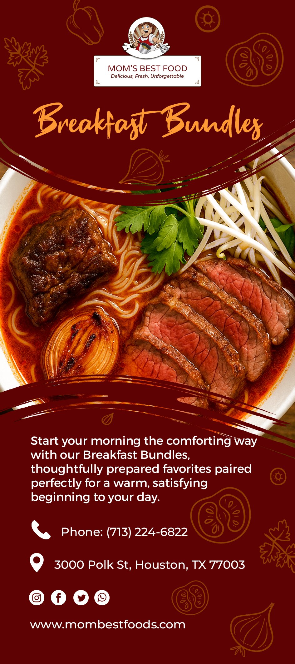
  • Banner Stand: I designed this banner stand to feel bold, comforting, and immediately inviting something that stops people as they walk by and makes them hungry at first glance. I centered the design around a large, appetizing Beef Noodle Soup to create instant impact, using warm red tones and wood textures to evoke a cozy, home style breakfast atmosphere.

Digital & Social Presence
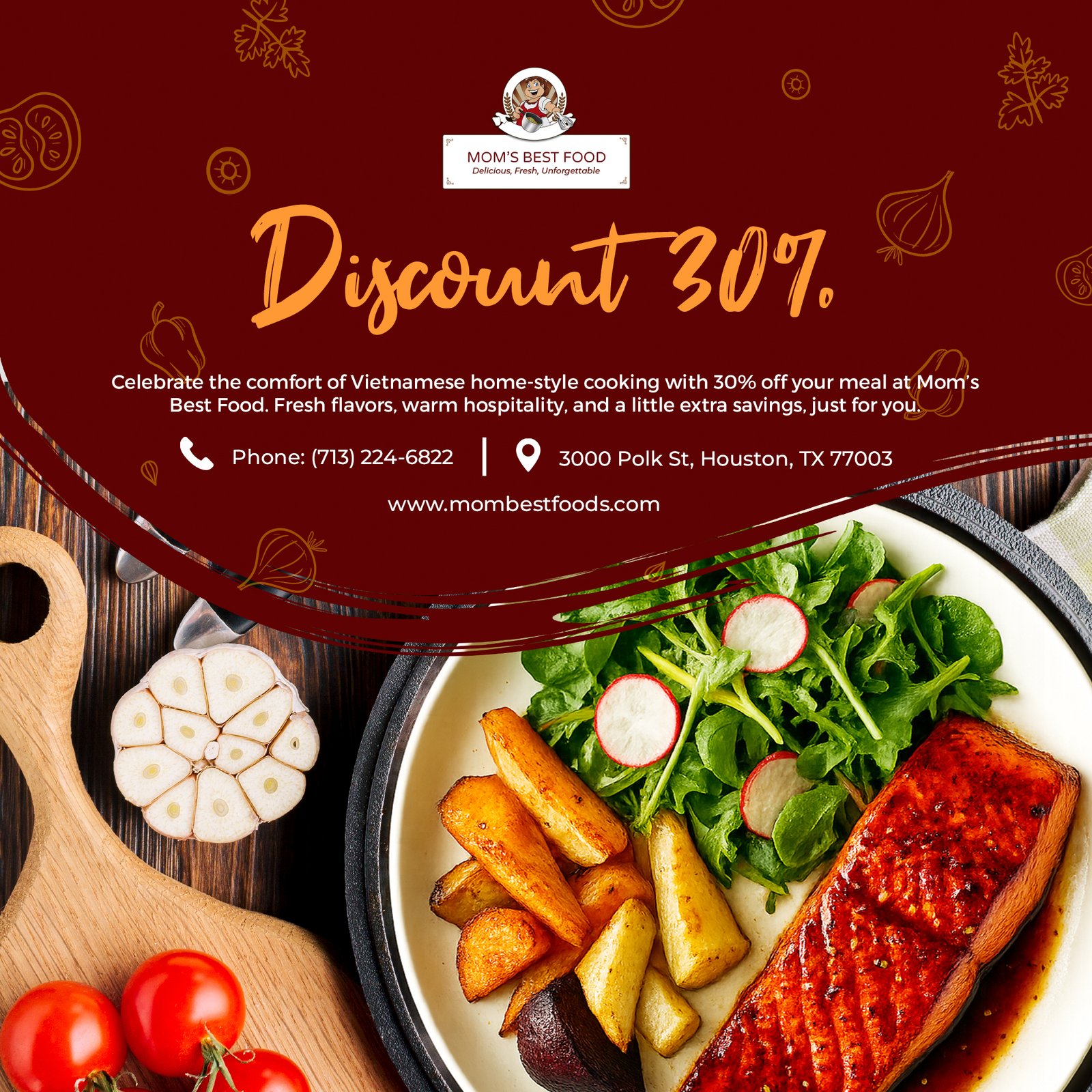
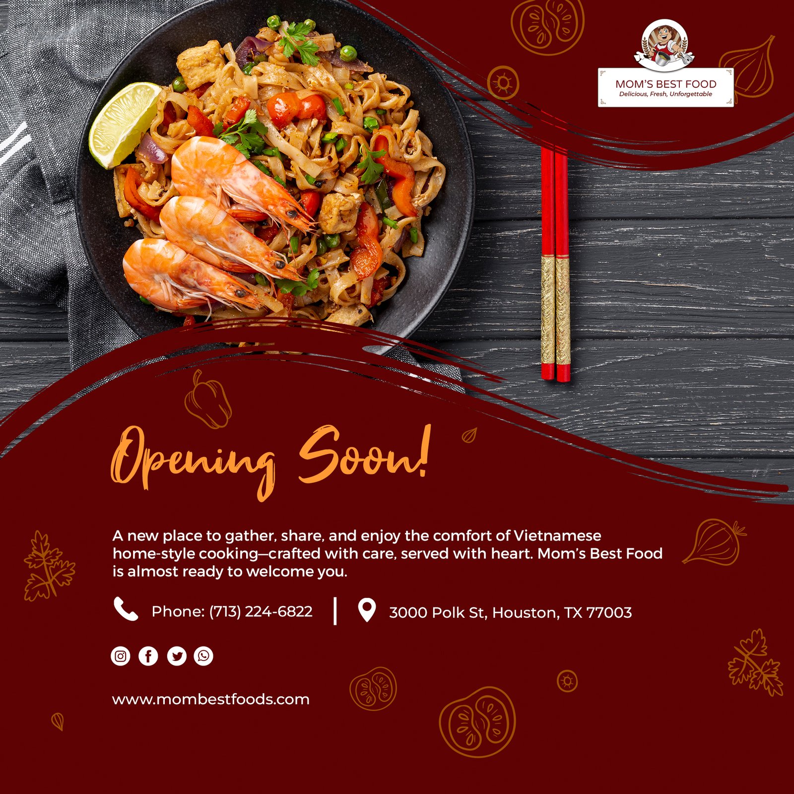
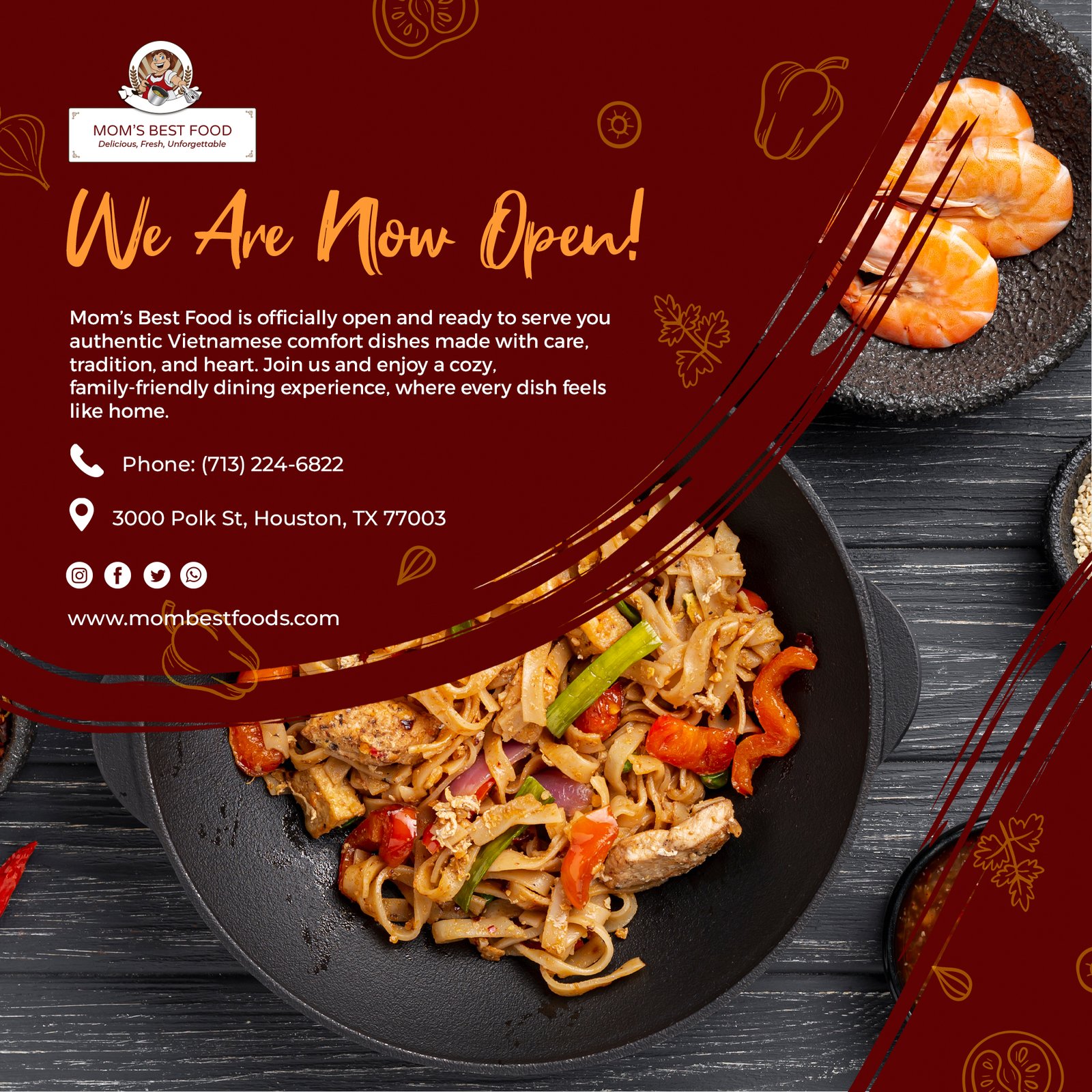
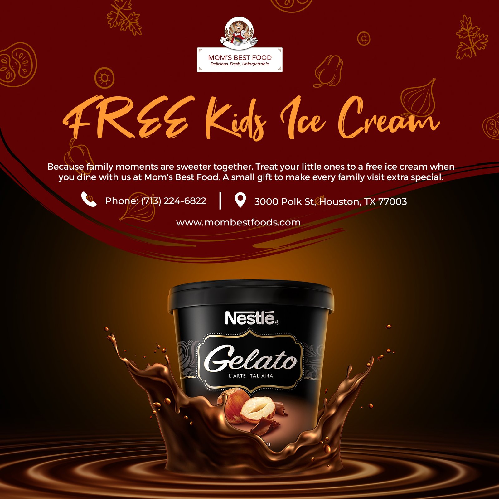
  • Facebook & Instagram: I designed this series of Facebook and Instagram posts to feel warm, inviting, and instantly recognizable as Mom’s Best Food while stopping the scroll with rich color and mouthwatering imagery. I used bold, deep red backgrounds paired with vibrant food photography to create strong contrast and appetite appeal, making each post feel comforting yet exciting. The flowing brush stroke elements and handwritten style headlines add a personal, handcrafted touch, reinforcing the feeling of home style cooking made with care.
  • Order Online: I designed a cinematic video intro to establish the brand’s emotional tone. Warm lighting, slow motion, and minimal text help communicate comfort, quality, and hospitality before customers interact with the menu or ordering system.

Result

  • The refreshed brand elevated the restaurant’s visual identity, improved menu readability, increased social media engagement, and strengthened the overall customer experience, from dine-in ambiance to online ordering convenience.

Next Projects