Matrix DVD-R CES Las Vegas Campaign

Category: Trade Show Branding & Print Design
Employer: PLC Multimedia Inc.
Industry: DVD Recordable Disc
Location: California, USA
Deliverables:

OVERVIEW

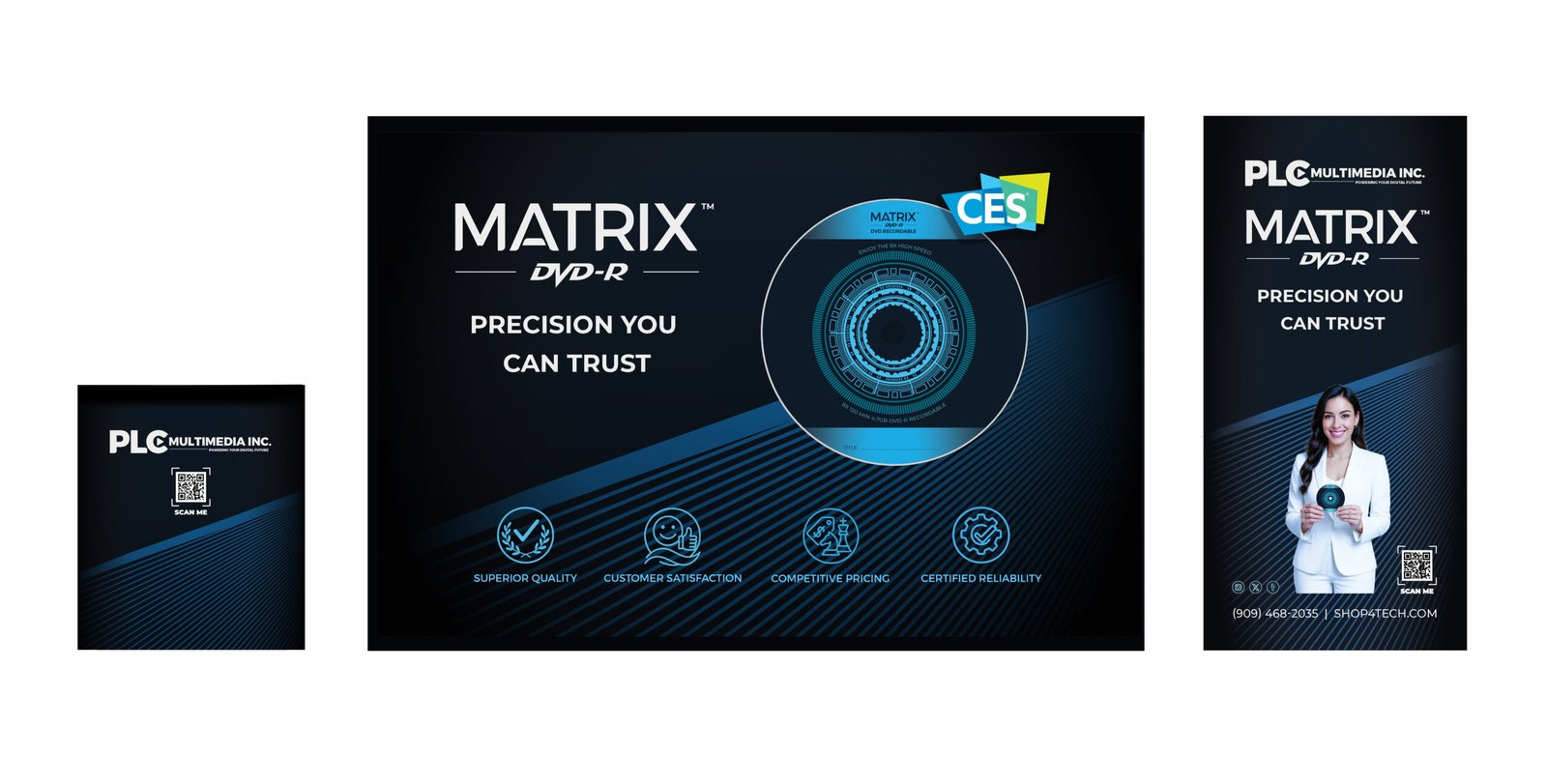
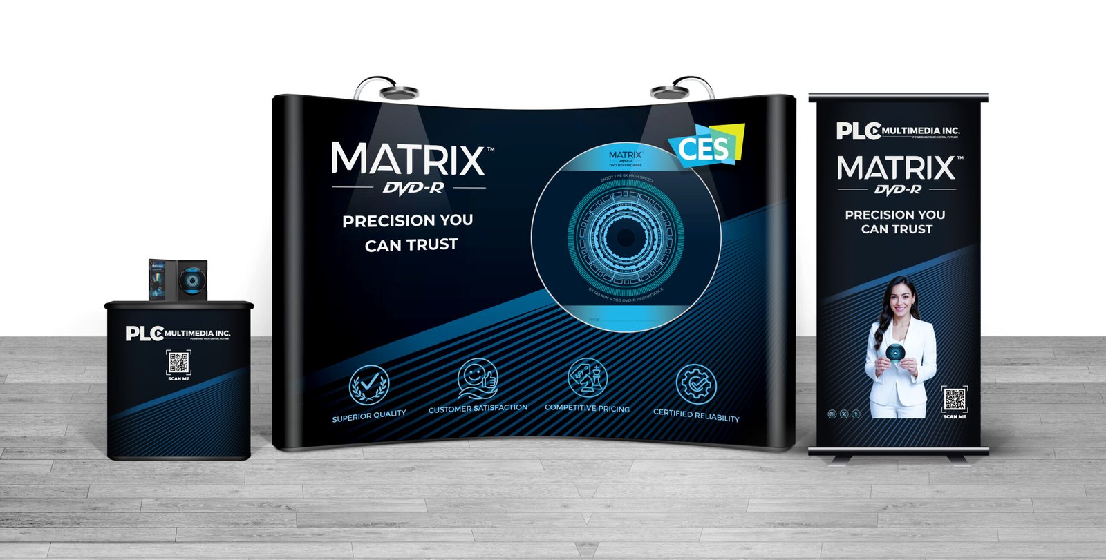
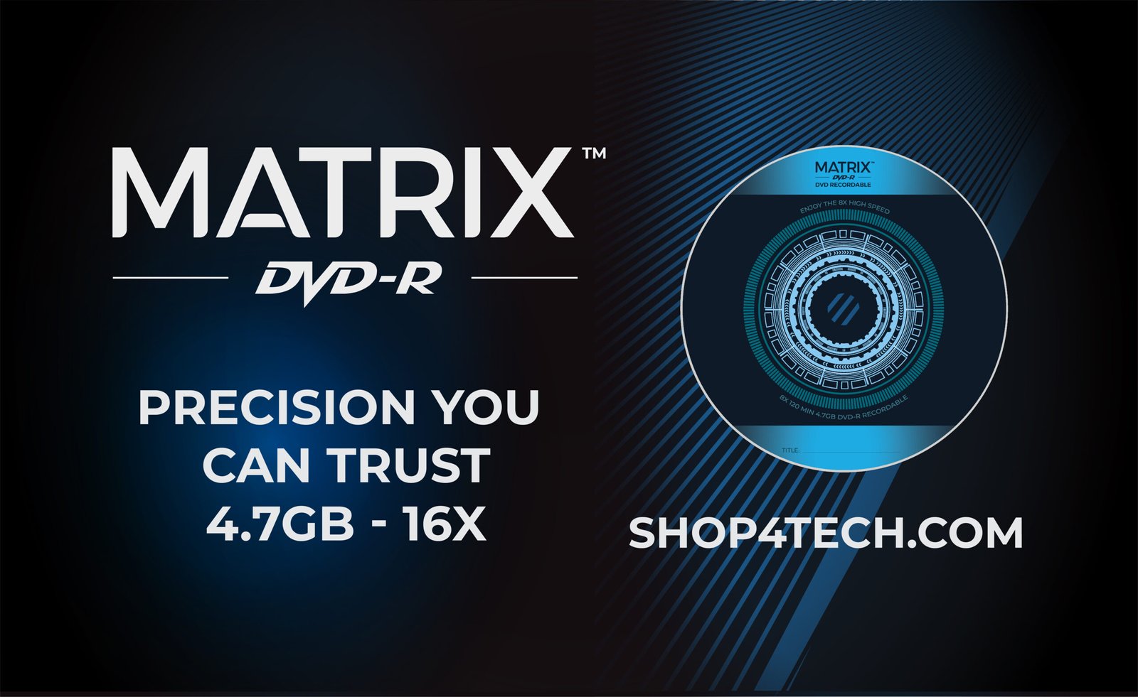
The Matrix DVD-R Recordable project was created as a complete branding and promotional package for PLC Multimedia Inc’s appearance at the Consumer Electronics Show (CES) in Las Vegas. The goal was to position the Matrix DVD-R as a next-generation storage solution while highlighting its reliability, performance, and lifestyle appeal.

ROLES

Team Designer (Me)
  • Led the creative direction from concept to final execution.
  • Designed all print, display, and digital assets.
  • Balanced brand consistency with campaign goals.

Marketing Manager
  • Defined target audience and campaign objectives.

  • Provided input on messaging, brand tone, and sales pitch.
  • Approved concepts aligned with marketing strategy.

Sales Manager
  • Shared insights on customer needs and sales priorities.

  • Guided which products on sales.
  • Ensured designs supported sales conversations at the trade show.

THE STRATEGY

I designed a complete marketing package for Matrix DVD-R. Furthermore, to amplify the campaign beyond the event, we launched a 20% discount on all CD/DVD sales, promoted through social media posts tailored to creators, tech enthusiasts, and professionals. Moreover, to keep the momentum going, we introduced a twice weekly newsletter to strengthen customer relationships and boost sales.

The Challenge

How did I make the Matrix DVD-R stand out visually, communicate its reliability and innovation, and build trust with both tech professionals and everyday consumers.

the Approach

I approached this campaign with a bold, modern visual identity that blended technology with consumer appeal. My strategy focused on clean, futuristic design language and vibrant brand colors.

mood board (Typography, Colors and Tech Imagery)

I gathered inspiration that captured a futuristic yet approachable feel. This mood board explores colors, textures, and visuals that reflect innovation, technology, and energy.

  • Typography: Bold, all caps headlines communicated authority and confidence, while sans-serif body fonts maintained clarity in technical details.
  • Montserrat: Clean and modern.
  • Haettenschweiler: Tradition and reliability.
  • Majestic: Luxury and modern elegance.
  • Colors: Dark navy blue served as the primary backdrop, projecting reliability and professionalism. Neon blue was used as a highlight, creating a glowing, high tech energy that mirrored the futuristic of CES.
Primary Secondary Accent Accent
#003333 #006699 #0099cc # fbfbfb
Dark Navy Blue Teal Blue Neon Blue Bright White
Base, Strong Reliability, Focus Highlight, Sci-Fi Contrast Balance
  • Imagery: Futuristic infographic elements tech supported the engineering side of the brand.

Design Decisions

Collaborating with the Marketing and Sale Manager, we modified the Matrix’s appearance and character based on their input. Once the concepts were approved, I developed design concepts that balanced futuristic energy with consumer connection.

The Execution

Motion
  • Video Intro: I created this video intro to feel cinematic, precise, and immersive, using directed motion design and AI-assisted visuals to explore light, movement, and digital energy. Each clip was perfectly synced to the beat of the background track, and composed to support the Matrix DVD-R identity and reinforce a sense of high-tech, reliability and performance.

Core Brand (Logo, Flyer, Brochures, and Business Cards)
  • Logos: I designed this logo system to feel bold and modern. The strong typography communicates reliability and confidence, while the subtle play icon references multimedia and motion. The light and dark variations ensure flexibility across digital, print, and motion applications, creating a consistent and professional brand foundation.
  • Flyer: I designed this Matrix DVD-R flyer to capture a modern and high tech energy. I used deep blue gradients, digital light streaks, and a glowing disc illustration to express speed, performance, and precision. My layout focuses on clean hierarchy: product story on the left, benefits and icons on the right, creating a balanced structure that’s easy to scan.
  • Brochures: I used deep, modern colors and glowing digital light streaks to create a high tech atmosphere. The sleek disc image on the cover sets the tone, while the inside panels I added the mission, story, and testimonials.
  • Business Cards: I used the same diagonal light streaks, deep blue gradients, and the glowing disc graphic for the business cards. One side represented the corporate brand, while the other highlighted DVD-R Matrix’s product identity, merging innovation with personal networking.
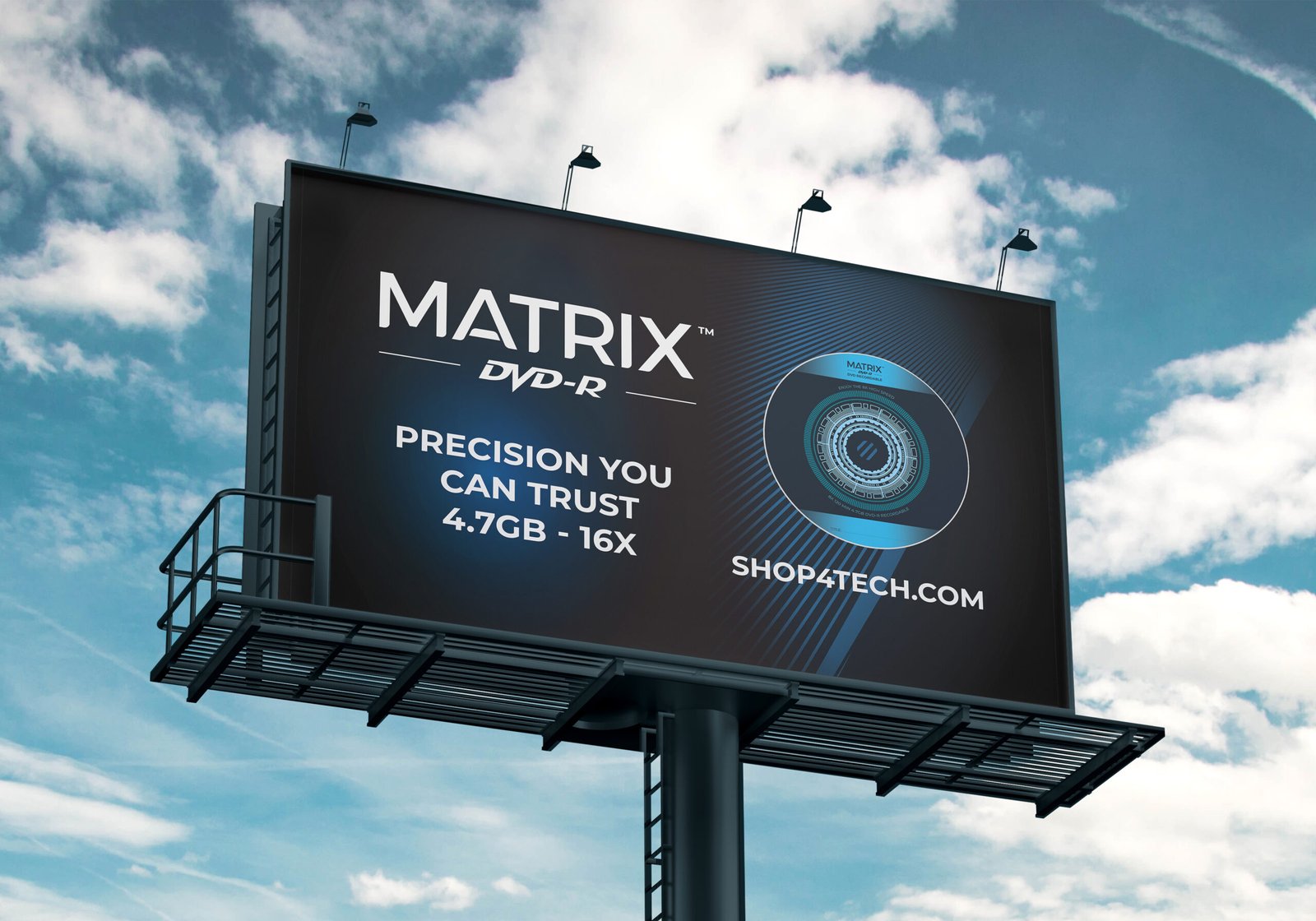
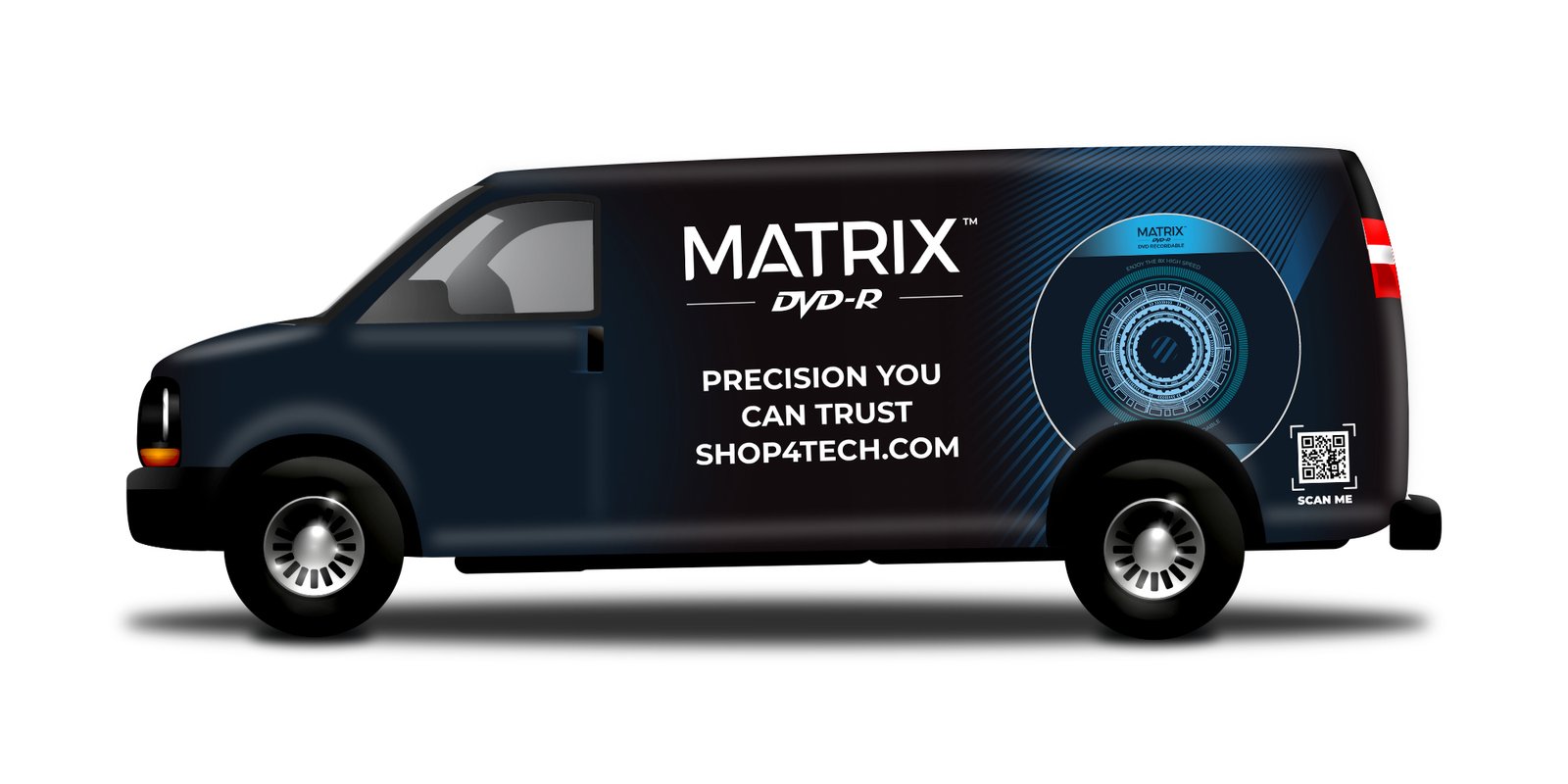
Displays (Matrix DVD Disc Artwork, Demo Display, Trade Show Backdrop, Billboard, and Vehicle Wrap)
  • Matrix DVD-R Disc Artwork: The design features a pattern with futuristic elements, radiating from the center, symbolizing speed, connectivity, and digital precision.

  • Trade Show Backdrop: To create a compelling backdrop, I added the oversized disc artwork which anchors the space at the center, becoming the hero graphic that tells the entire product story in one glance. I placed the CES badge near the disc intentionally so that it adds credibility. Under the main headline, I added four key icons: Superior Quality, Customer Satisfaction, Competitive Pricing, and Certified Reliability. On the right side, a vertical banner stand emphasized selling points with a friendly model to humanize the brand, while on the left side, a custom kiosk counter and promotional display were placed.
  • Billboard: By using bold white typography, a deep dark gradient, and the glowing Matrix DVD-R disc, I would like to create a clean, high tech look that stands out from a distance. The layout is simple and confident, focused on clarity and brand strength, ensuring the Matrix identity remains instantly recognizable even at highway speed.
  • Vehicle Wrap: By using the same deep navy tones and diagonal energy streaks, I added the big DVD disc that stands out even while the van is moving. Also, The large, centered typography keeps the message clear from a distance, while the QR code adds a modern, interactive touch
Digital (Facebook & Twitter Posts, and Newsletter)
  • Facebook & Twitter Posts: I designed this social media promo to be bold, fast, and instantly attention grabbing. By pairing an urgent headline with a clean, high contrast layout, I focused the viewer immediately on the special offer. The glowing Matrix DVD-R disc and diagonal streaks add motion and a high tech feel, while the 20% off badge and QR code drive engagement. Every element was crafted to stand out in a busy feed and keep the Matrix brand consistent across digital platforms.
  • Newsletter: To create a bold, energetic, and sales-driven newsletter, I used a dark navy background and a large white font for the headline, ‘BURN MORE, PAY LESS.’ This strong contrast immediately captures attention. I also included the sales pitch from the Marketing Manager. Furthermore, the ‘Similar Items’ section at the bottom extends the promotion beyond a single product, encouraging customers to explore more and boosting potential upsell opportunities.

Impact

30% increase in revenue
  • Following its showcase at CES in Las Vegas, the Matrix DVD-R Disc generated a huge increase in revenue within 3 months.

Happier customers
  • Affordable. High quality. Loved by customers.

Next Projects