Packaging Design

Category: Packaging Design
Client: L&V FoodSupply, Inc.
Industry: Food
Location: Texas, USA
Deliverables:

OVERVIEW

A company specializing in authentic Asian food products, needed packaging that could stand out in competitive retail spaces while staying true to its cultural roots. The project covered four product categories — noodles, rice, coffee, and fish sauce — each requiring its own visual identity but also a cohesive family look.

ROLES

Team Designer (Me)
  • Packaging design

Marketing Manager
  • Defined target audience and campaign objectives.

The Challenge

Build a unified packaging system that enhances shelf appeal, builds consumer trust, and strengthens brand recognition.

the Approach

  • Studied competitor packaging in Asian/International grocery markets.
  • Created moodboards (color palettes, typography styles, packaging formats).
  • Focused on balancing authenticity with a modern retail look.
mood board (Typography and Imagery)

I began by creating a mood board that brought together typography and imagery. Since each product design carried a different color, I added each color palette with each design. This mood board served as a creative compass, ensuring every design decision reflected the brand’s values of authenticity, quality, and trust. By analyzing competitor packaging and consumer expectations, I was able to identify opportunities to make L&V’s products stand out on crowded shelves while still feeling culturally connected and modern.
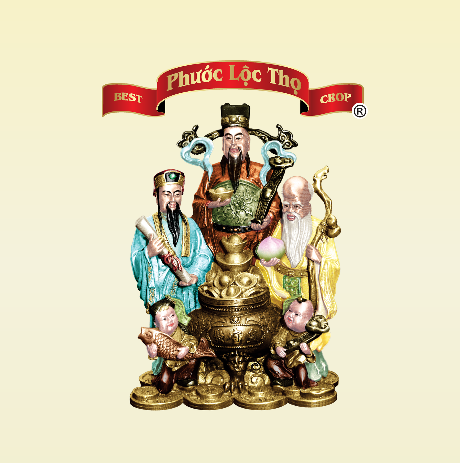
  • Typography : Bold sans-serif fonts ensure clear shelf readability, while subtle serif details add cultural character and sophistication.

    • HelveticaNeue: Modern and Geometric.
    • League Gothic: Tradition and Reliability for logo.
    • Adobe Caslon Pro: Warm and modern.
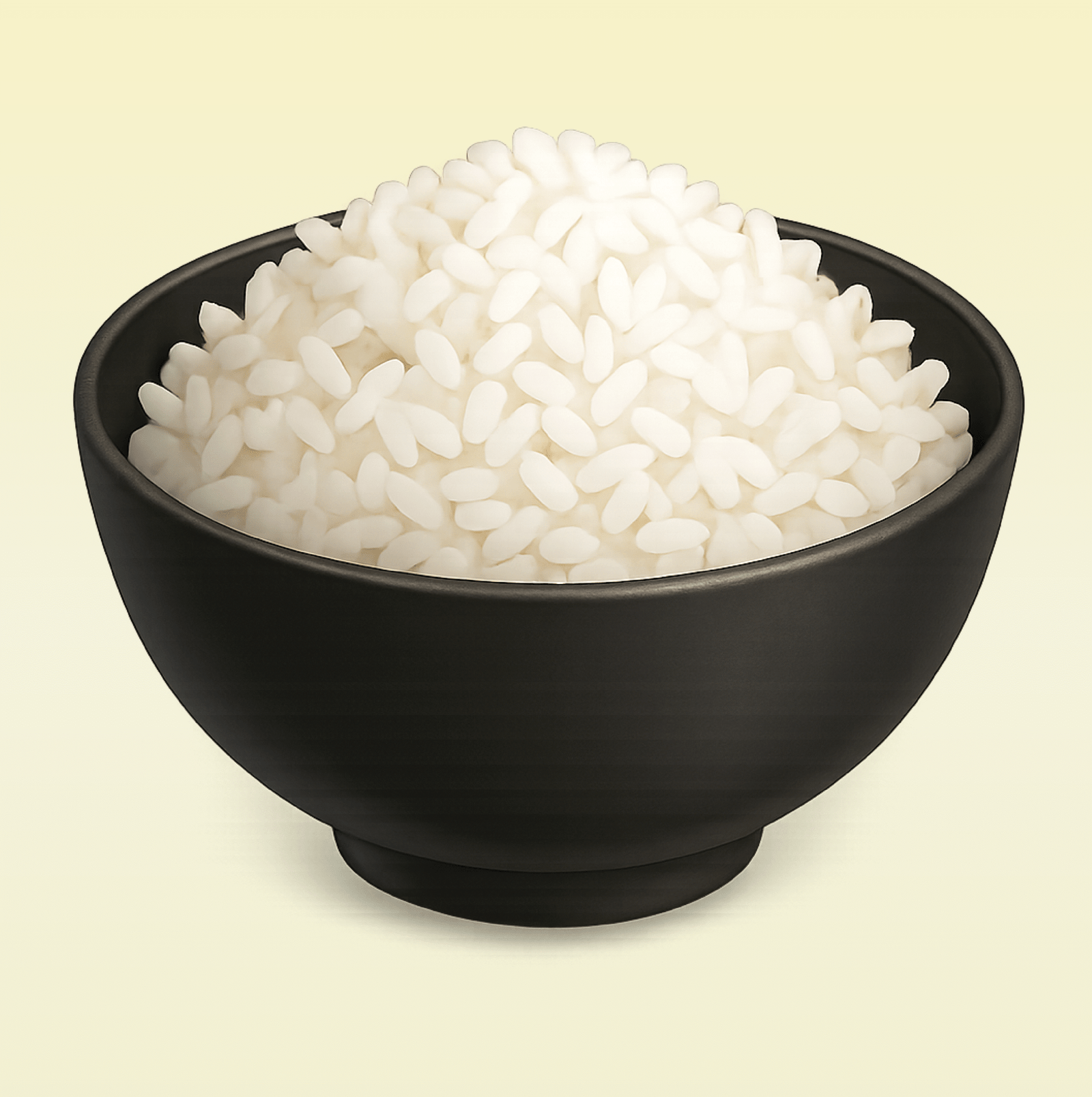
  • Imagery : Using modern photography of natural ingredients like rice, rice noodles, and vegetables links the packaging to both nature and tradition.

Design Decisions

After narrowing down directions with the Marketing Manager, I refined the typography, adjusted the color contrast for shelf readability, and aligned graphic elements to create consistency across all five packaging designs. The focus was on making sure each product stood out individually while still being unmistakably part of L&V Food Supply.

The Execution

Video Intro
  • I created this video intro to introduce each design, Rice, Coffee, Noodle and Fish Sauce. I added text captions for each product. Each clip was perfectly synced to the beat of the background track.
Logos
  • I would like to design the logo to feel like green, quality food and a brand that grows alongside the businesses it supports. The Owner would like to have initial name on the logo, which are L&V. I added fruits icons to speaks to the heart of the company’s work.
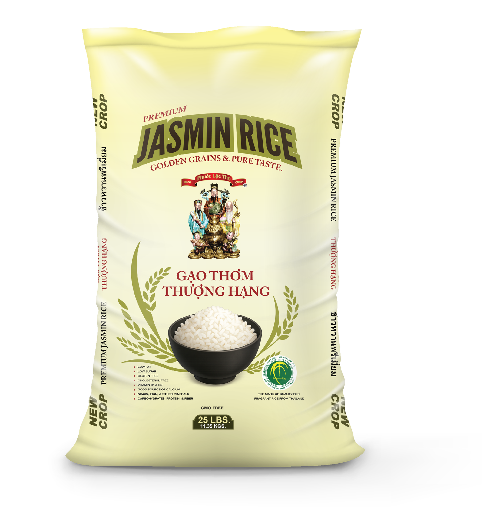
Premium Jasmin Rice Packaging
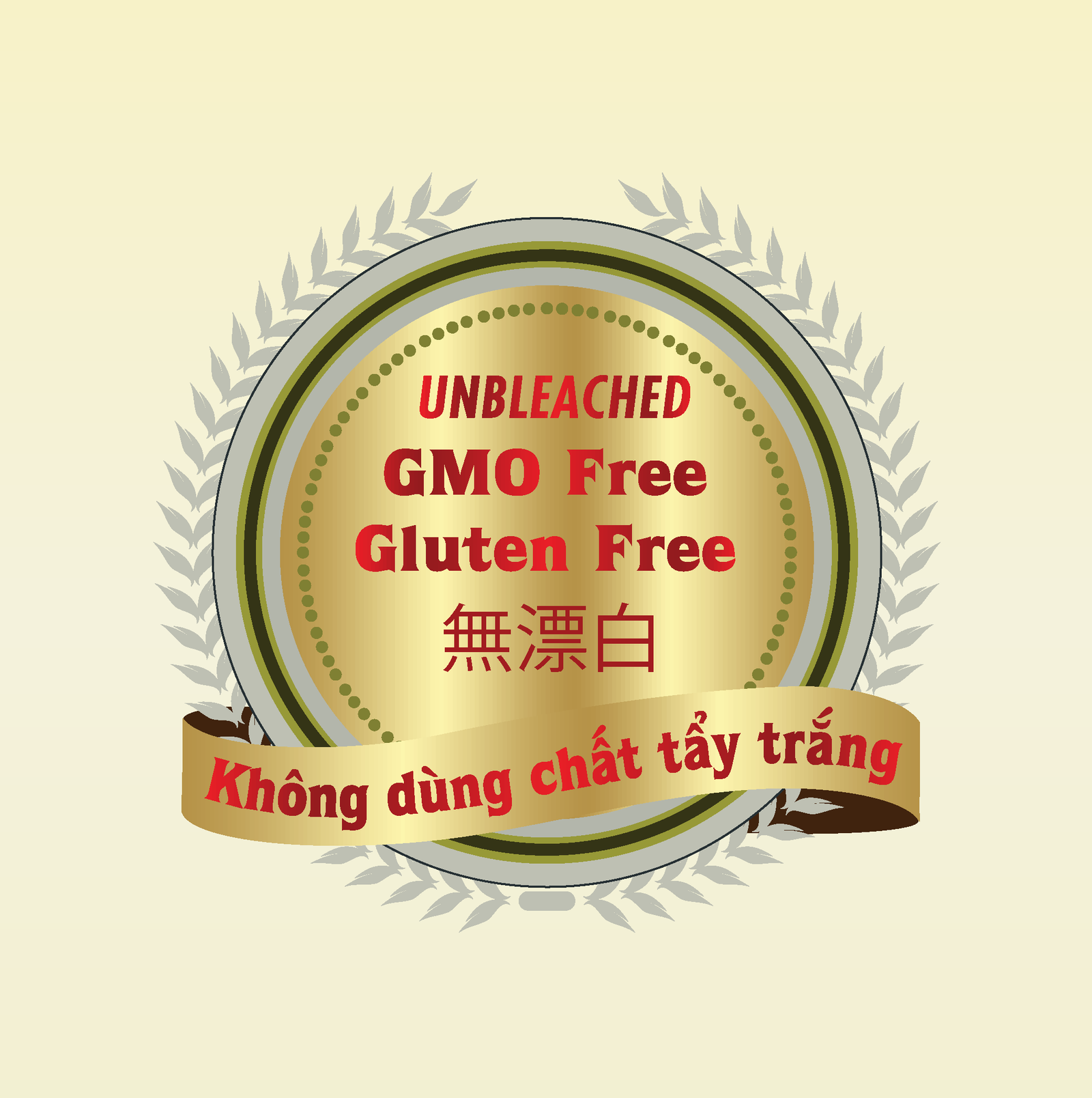
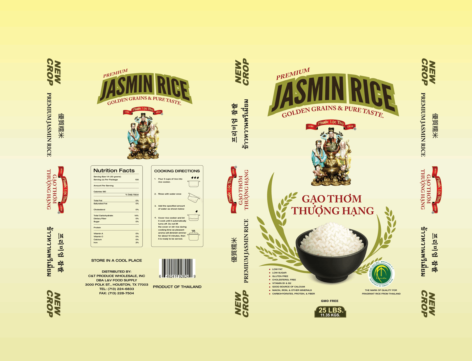
  • Based on research and references, I chose a soft cream yellow background to reflect purity and warmth, and kept the layout clean and balanced to highlight the product itself. This packaging was designed to elevate a traditional staple into a premium product. I combined warm, natural tones with bold typography to build strong shelf presence and trust.
  • Color Palette


#F6ECA9: Primary
(Golden Cream – Warm)
Background


#003333: Secondary
(Yellow Green – Renewal and growth)


#A73232: Accent
(Deep Red – Text and ribbons)


#006633: Supporting
(Dark Green – Logo)


#2B2B2B: Text/Details
(Contrast and clarity)

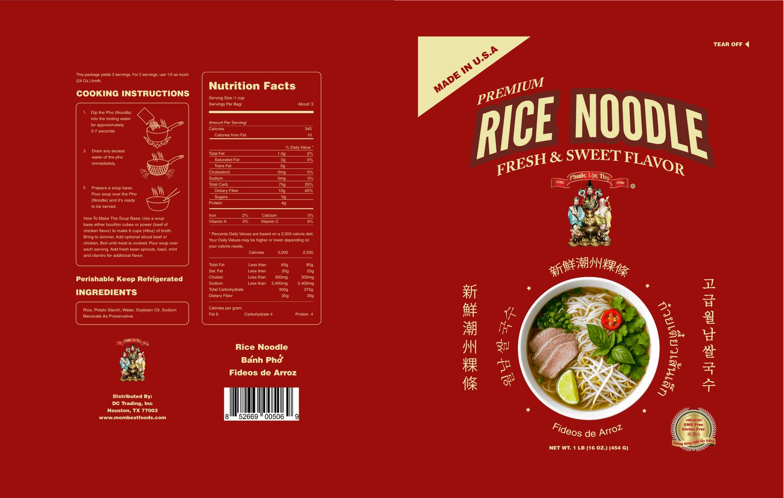
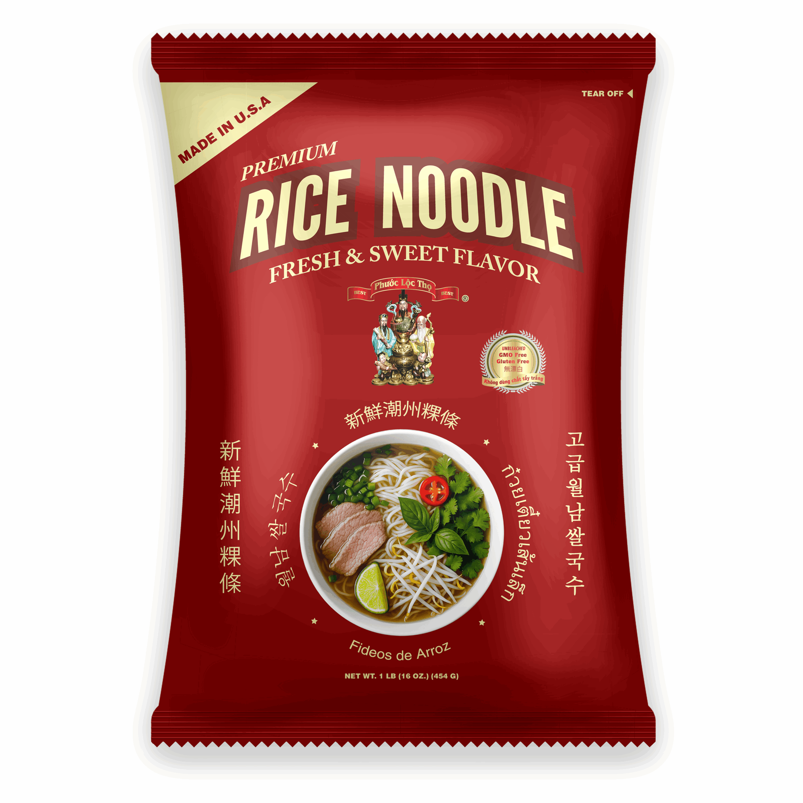
Rice Noodle Packaging
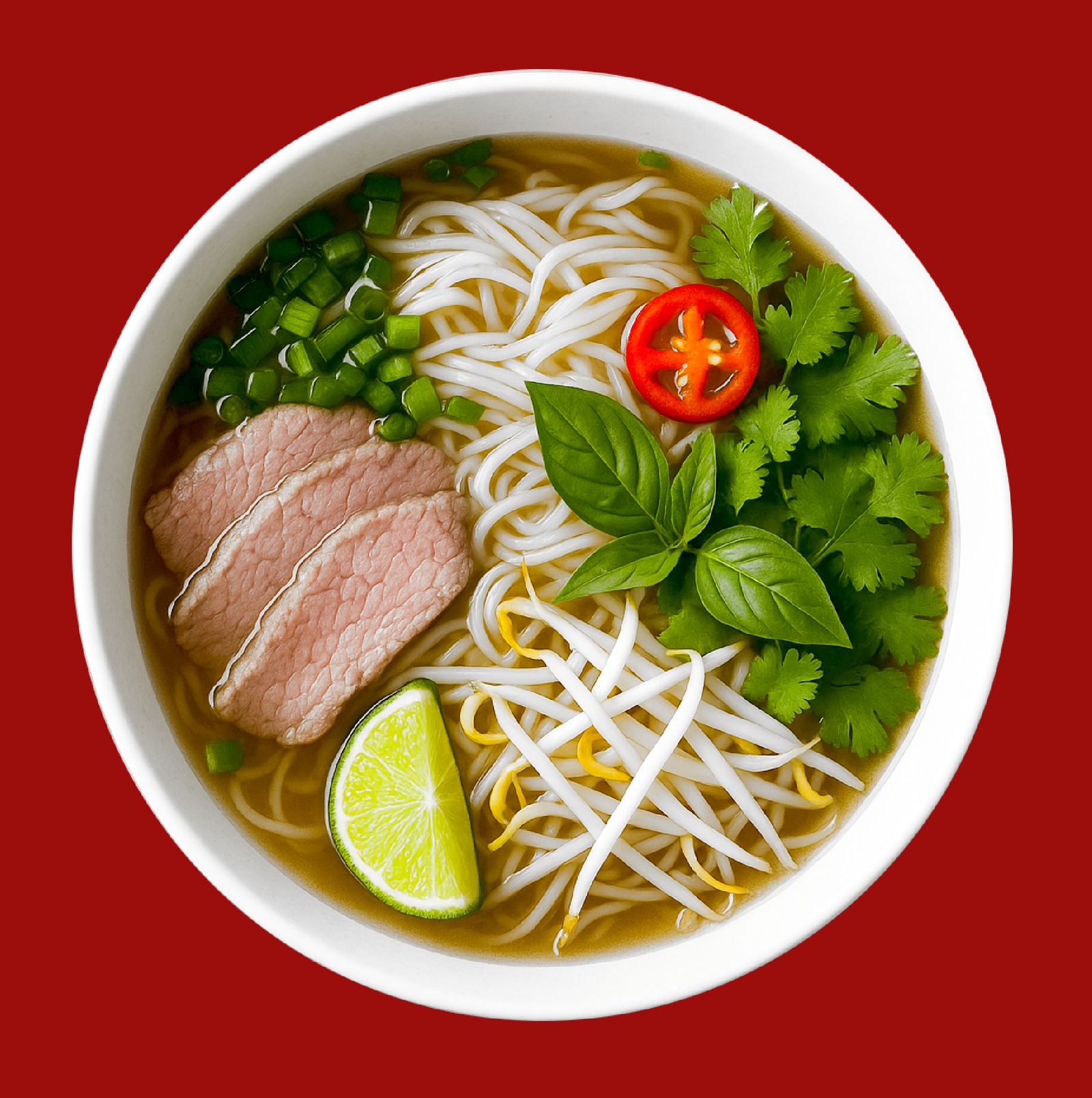
  • I would like to create a packaging design that communicates quality, tradition, and flavor while standing out on store shelves. My concept focused on a rich red background to evoke warmth, appetite, and cultural richness. In addition, A centered product photo showing a steaming bowl of rice noodles, making the flavor tangible even before opening the package.
  • Color Palette


#A73232: Primary
(Deep Red – evokes a feeling of appetite stimulation)
Background


#F6ECA9: Secondary
(Golden Cream – Warm)
Headline


#663333: Accent
(Dark Maroon – Rice Noodle Border)


#006633: Supporting
(Dark Green – Logo)

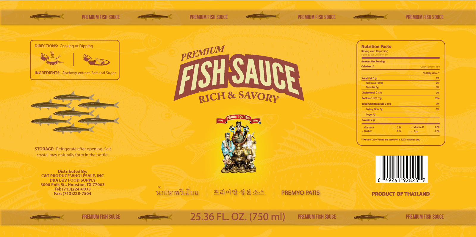
Fish Sauce
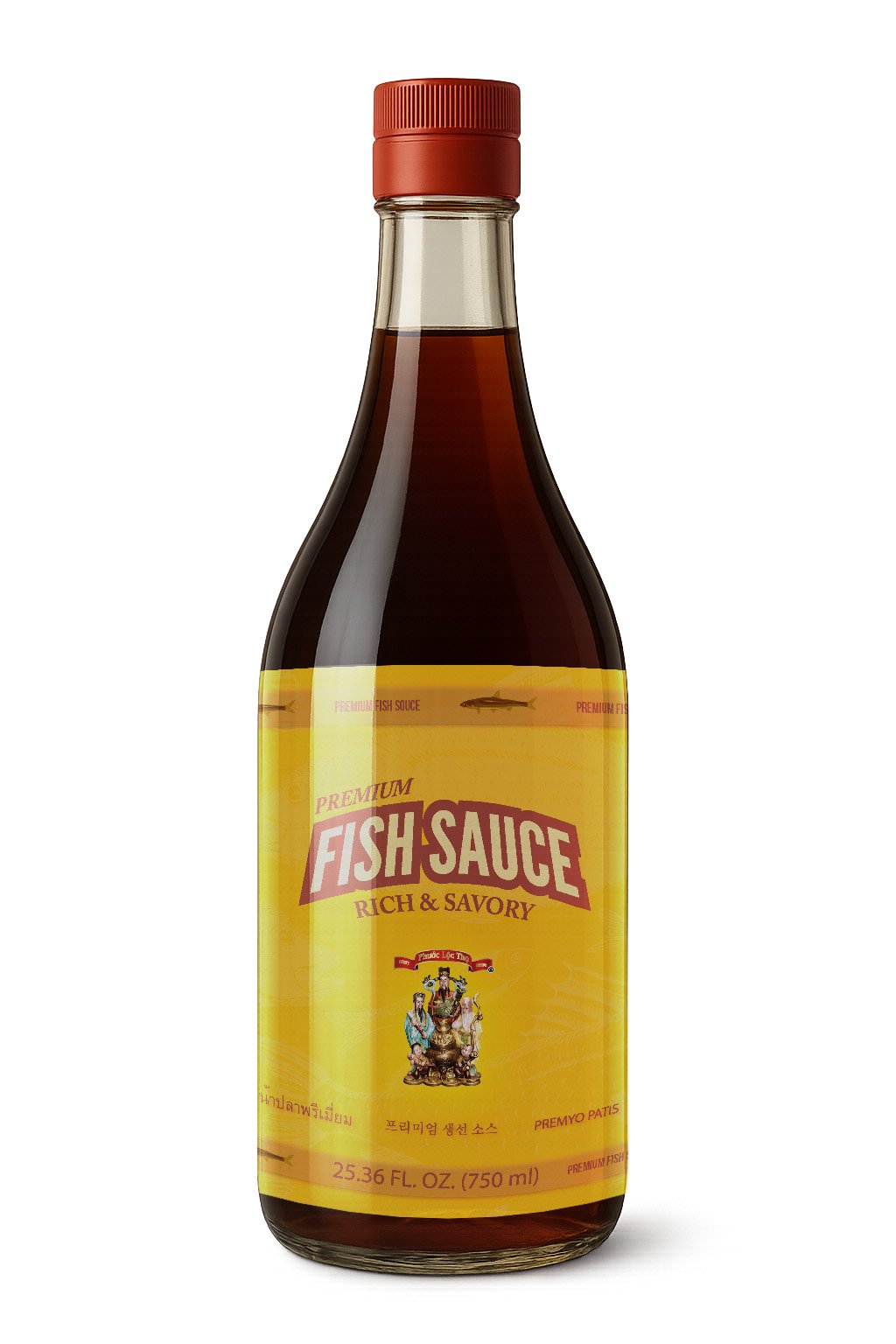
  • The golden yellow background was chosen intentionally, it evokes warmth, richness, and trust, while also making the product stand out boldly on the shelf. It gives the feeling of sunlight and craftsmanship, a nod to the traditional fermentation process. The deep brown typography adds a sense of strength, tradition, and appetite appeal, contrasting beautifully with the bright background.

  • Color Palette


#FFCC00: Primary
(Tangerine Yellow – stimulating the appetite)
Background


#993333: Secondary
(Dark Brown – evokes feelings of richness – Text details)


#A73232: Accent
(Deep Red – Ribbons)


#F6ECA9: Accent
(Golden Cream – Logo)

Instant Coffee
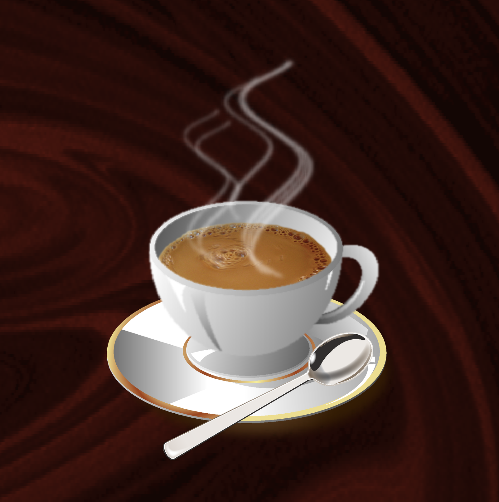
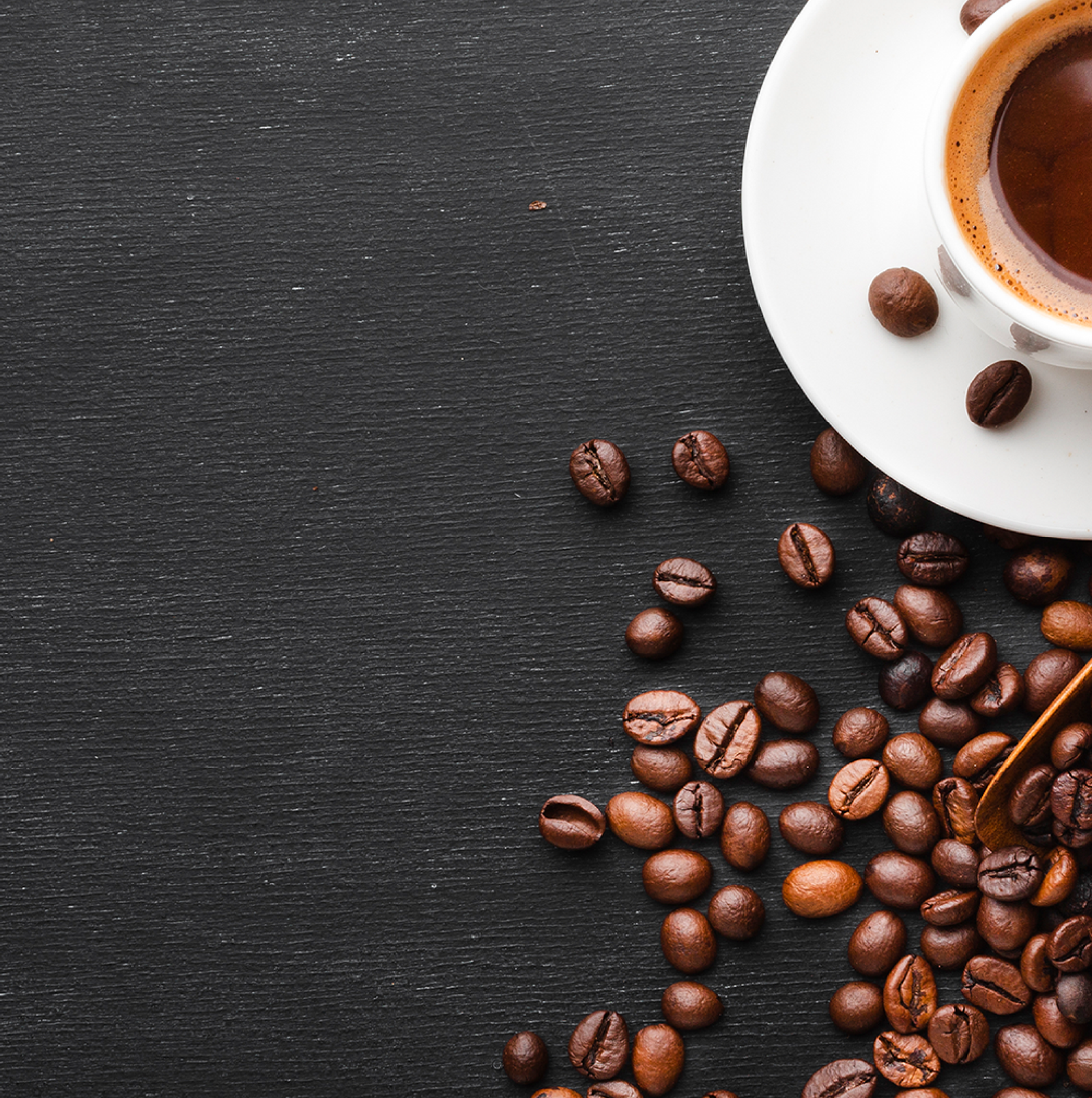
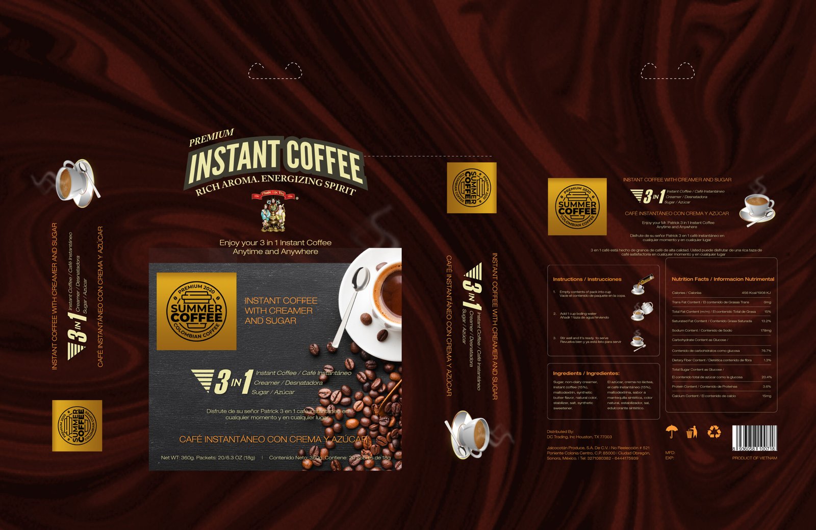
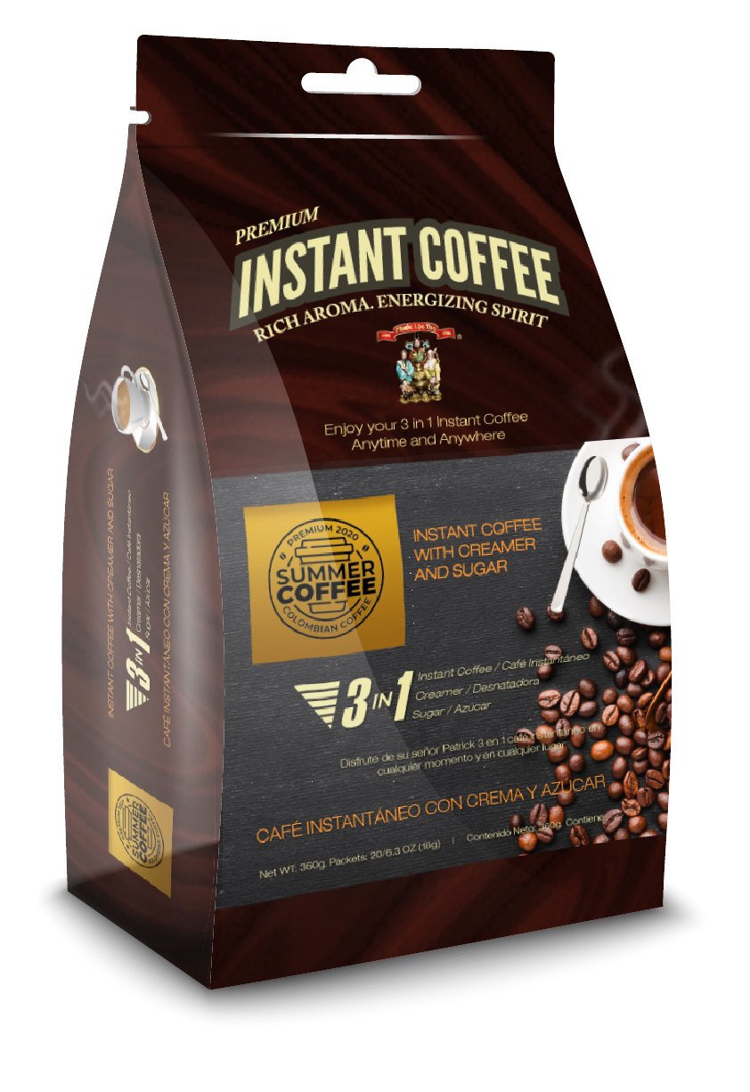
  • I used the deep brown background for the foundation of the design. It communicates bold flavor and premium quality, while visually echoing the color of freshly brewed coffee. The soft gradient and subtle texture create a warm and inviting atmosphere, much like the aroma of coffee itself. I added coffee beans and a steaming cup on the front panel represent the product’s instant enjoyment, anywhere.

  • Color Palette


#3B2A1A: Primary
(Deep Brown – Evokes a rich flavor)


#F6ECA9: Secondary
(Golden Cream –Text details)


#A73232: Accent
(Deep Red – Ribbons)


#1C1A17: Supporting
(Warm Brown – Logo)


#ff9933: Text/Details
(Golden Tan – Contrast)

The Group Presentation
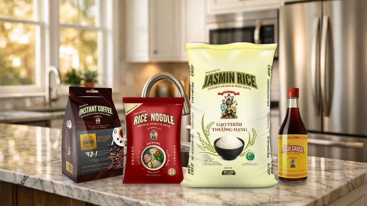
  • The group shot reflects unity, reliability, and care.

Key Takeaways

  • Each product, Rice, Noodles, Coffee, and Fish Sauce has its own identity while sharing a cohesive visual system. The result is a unified brand family that tells a story of culture, and authenticity through design.

Next Projects